


![]() Press release
Press release
1MB
![]() Comunicato stampa
Comunicato stampa
1MB
The New Brand Identity:
People at the heart of the project
VIDEO › www.horm.it/en/brand-identity
In 2017 the Horm Group acquired the prestigious #casamania brand, as part of a broader development strategy that the group is carrying out, with strength and determination. Following this #event it was necessary to review the Brand Identity of the group and of the individual brands, in part to make it clear to the public what path Horm and #casamania will take in the years to come.
A combination of products for both the Home and Contract sectors, in which both brands participate, maintaining their own philosophy and identity, while constantly seeking convergence, thanks to a profound restyling of individual products, with new colors, new veneers and even new shapes.
The graphic #design for the two brands is the same, so as to underline their complementarity.
A graphic grid on which to build the #design book: regular and equal spaces vertically with expertly disproportionate divisions lengthwise.
Font: a minimal and trendy stick font (Ano) combined with a graceful, elegant and refined font (Elektra).
Colors: the Graphite Gray that has characterized the image of Horm in recent years, combined with orange, the social color
of #casamania in its early years. In addition to the not to be left out Black and White.
A new Graphic Symbol shared by both brands: The common symbol stems from the desire to encircle the two souls of the group and to share the project idea: the letters H and C, in addition to being the two brands’ initials, are above all the initials of Home and Contract, the markets that the group works in.
Further information in the press release to download


solaio2
![]() 3066x2354, 1MB
3066x2354, 1MB
Barbara
![]() 6720x4200, 4MB
6720x4200, 4MB
Bolero1
![]() 6720x4196, 3MB
6720x4196, 3MB
Bolero2
![]() 8189x5039, 4MB
8189x5039, 4MB
Capriata
![]() 2706x3608, 2MB
2706x3608, 2MB
ComRi
![]() 5412x7216, 4MB
5412x7216, 4MB
Leon
![]() 6443x4102, 6MB
6443x4102, 6MB
PolkaDots
![]() 5412x7216, 3MB
5412x7216, 3MB
Solaio1
![]() 3066x2354, 1MB
3066x2354, 1MB
Spectro
![]() 6563x4078, 5MB
6563x4078, 5MB
StereoWood1
![]() 4480x6720, 3MB
4480x6720, 3MB
StereoWood2
![]() 4480x6720, 4MB
4480x6720, 4MB
![]() Press release
Press release
1MB
![]() Comunicato stampa
Comunicato stampa
1MB
Related news |
||
|
|
|
april 17, 2024
|
april 17, 2024
|
april 17, 2024
|
|
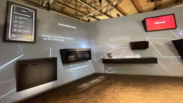
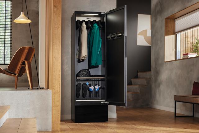
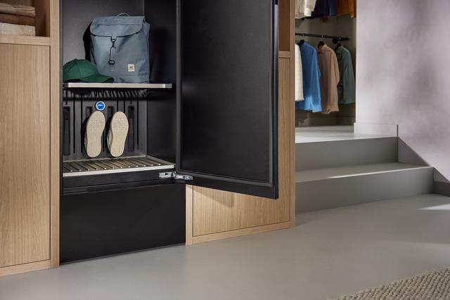
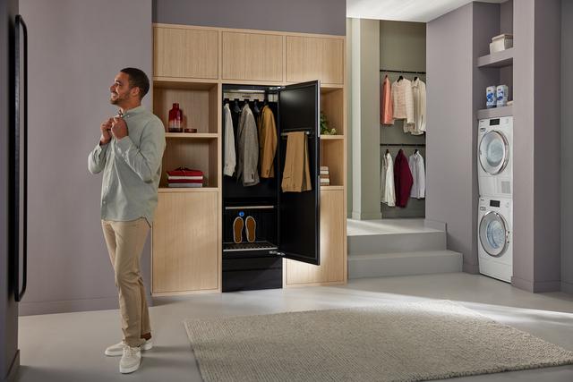
The focus is on elegant design and 125 years of MieleWith new colours pearl beige and obsidian black matt at the pulse of timeSust... |
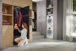
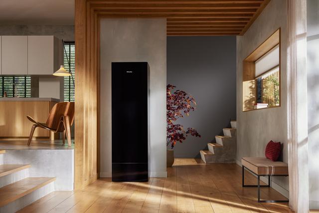
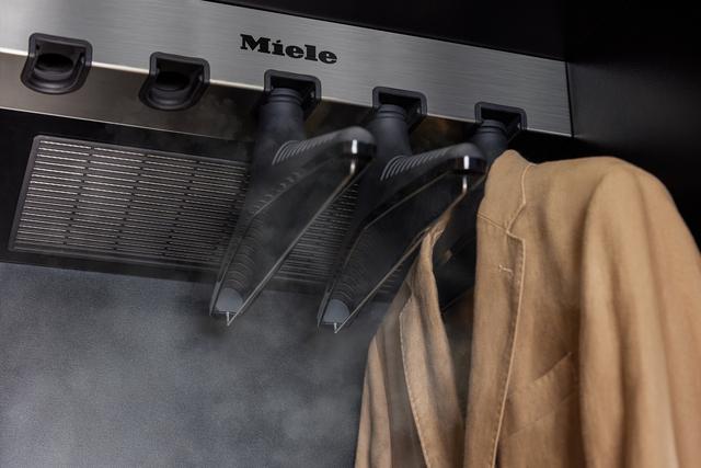
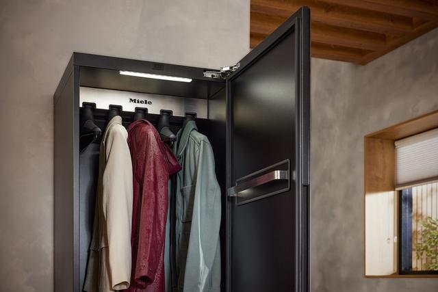
Refresh and dry garments with easeHygiene option for the additional deactivation of bacteriaElegant and versatile solutions that f... |
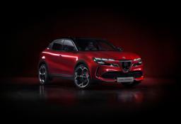
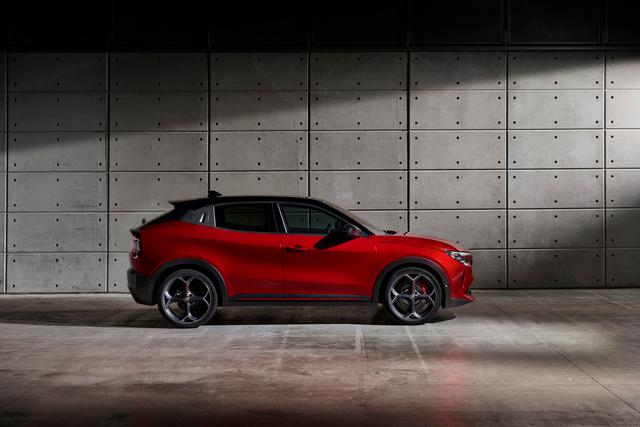
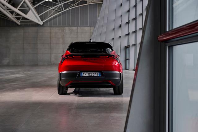
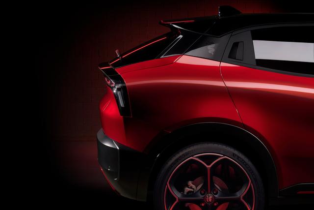
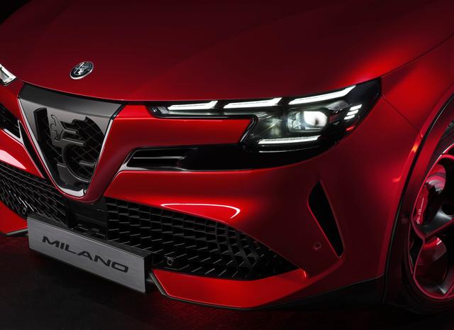
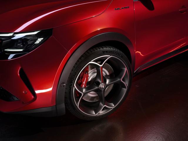
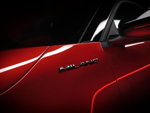
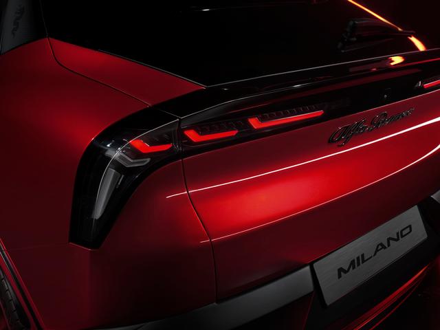
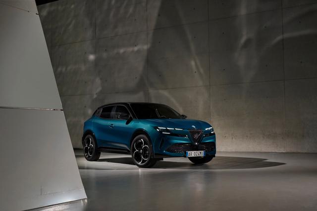
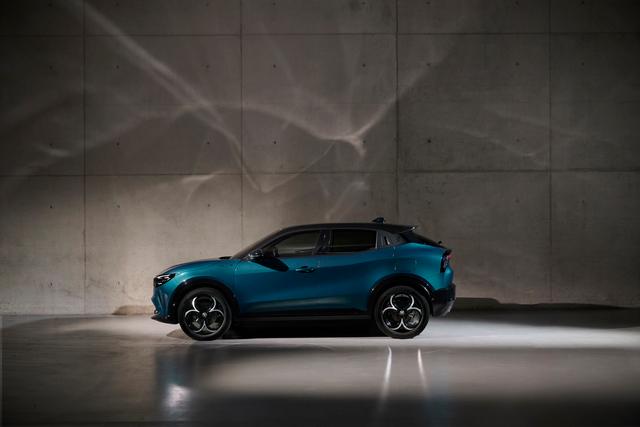
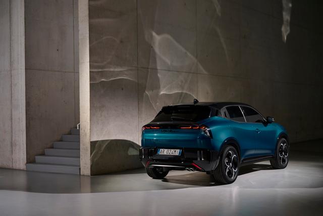
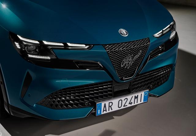
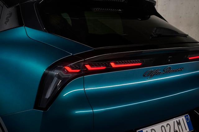
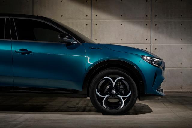
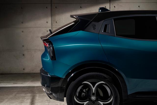
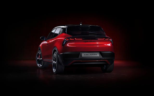
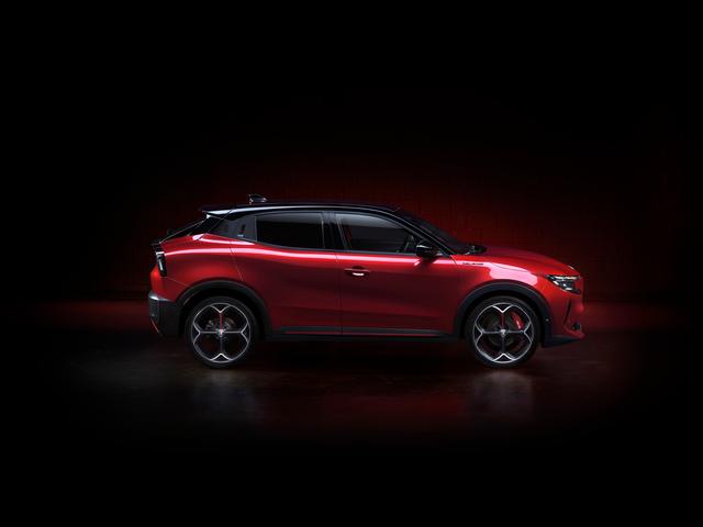
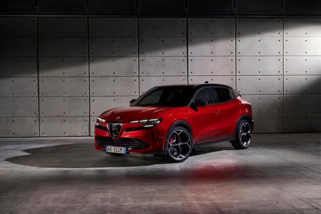
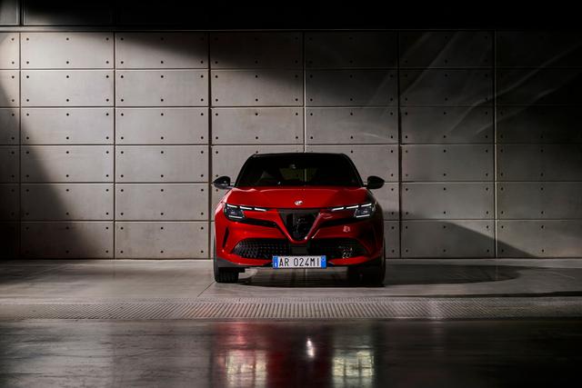
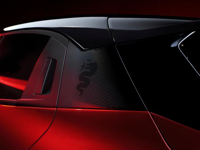
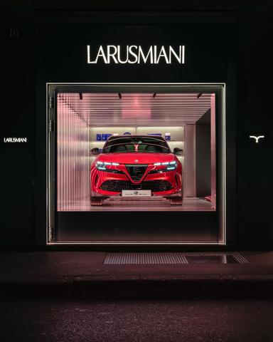
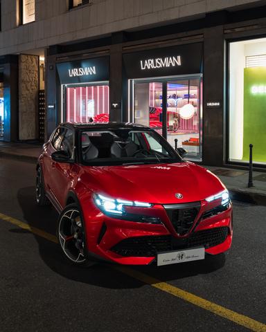
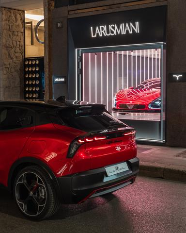
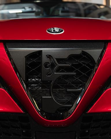
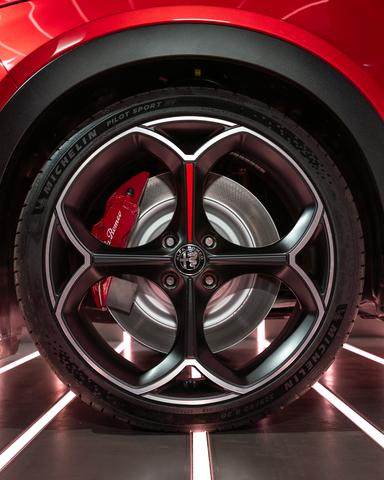
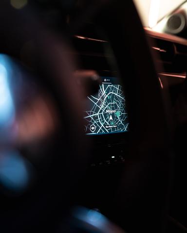
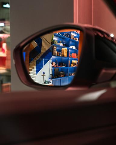
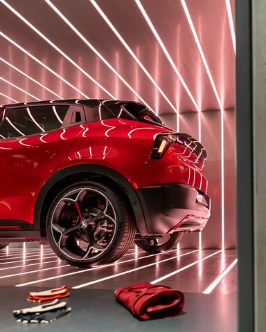
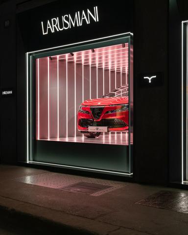
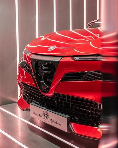
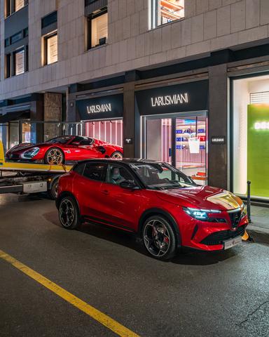
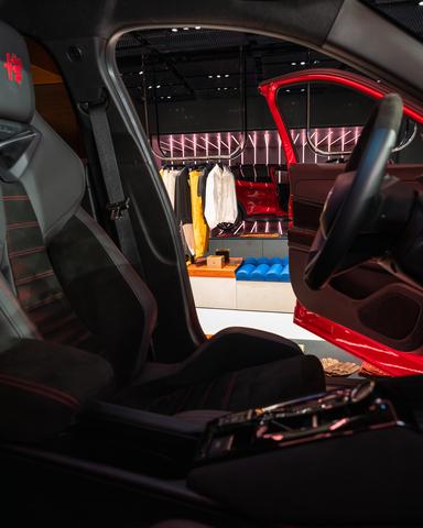
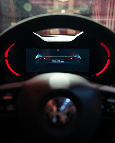
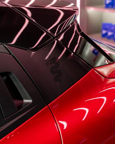
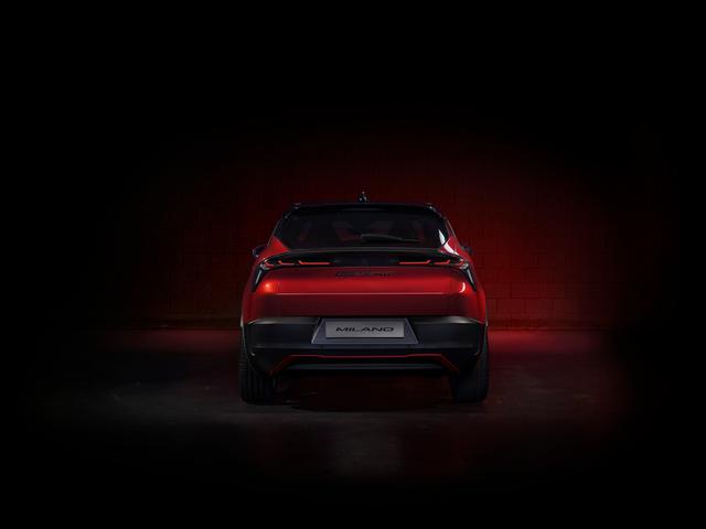
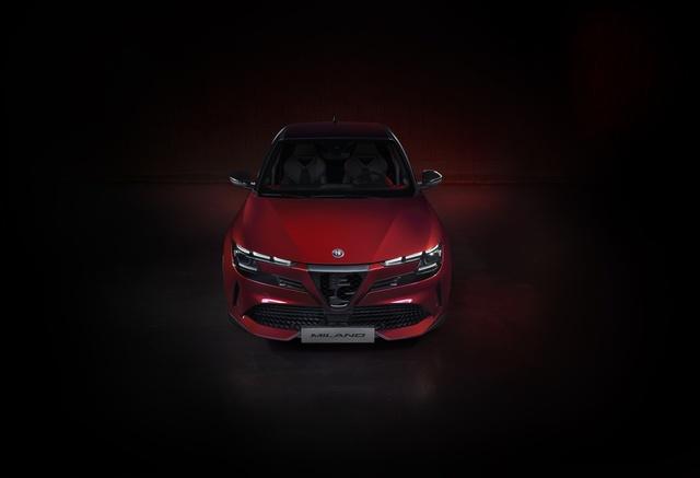
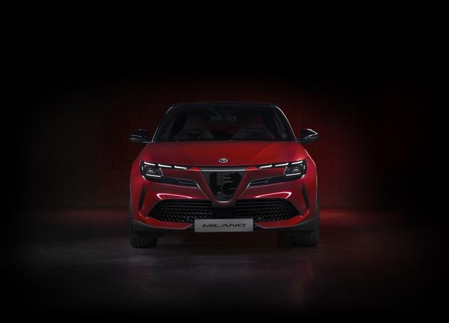
This evening, Monday, April 16, Alfa Romeo JUNIOR ushers in Milan Design Week, on show to the public for the first time at the LAR... |
You might be interested in |
||

|
|
|
april 17, 2024
|
april 17, 2024
|
april 16, 2024
|
|
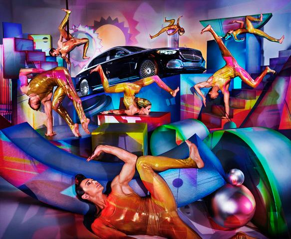
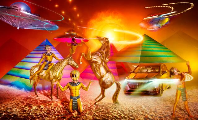
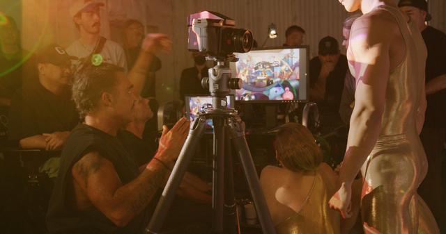
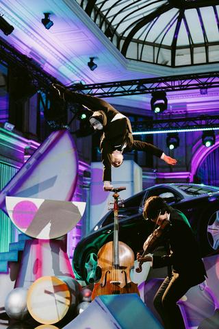
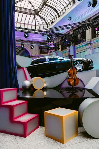
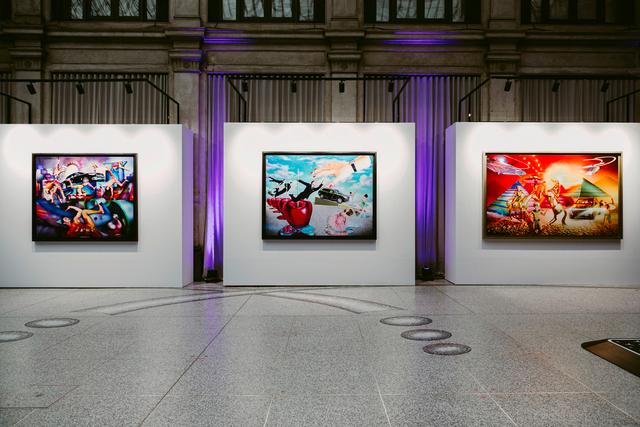
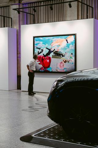
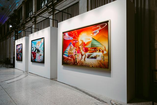
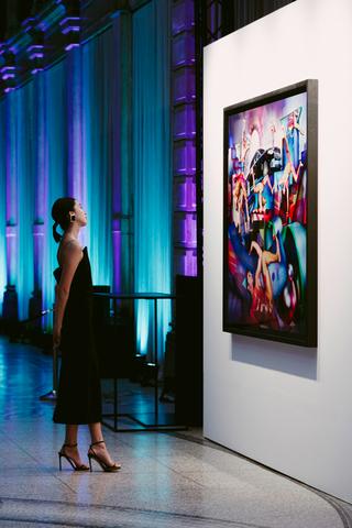
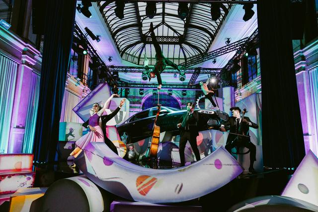
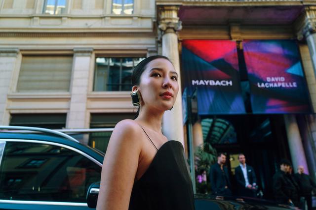
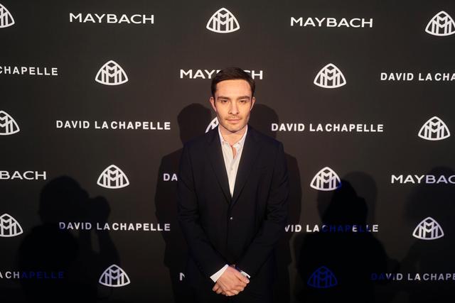
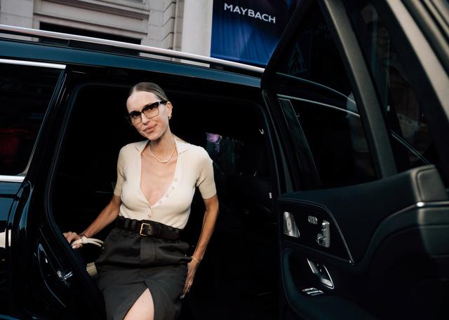
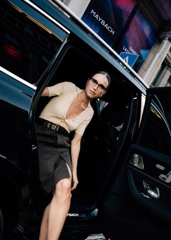
Longstanding collaborators Mercedes-Maybach and David LaChapelle reunite to create three artworks.David LaChapelle celebrates the ... |
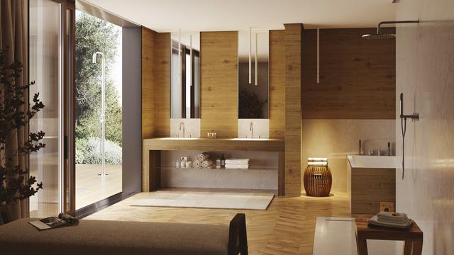
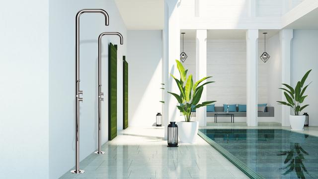
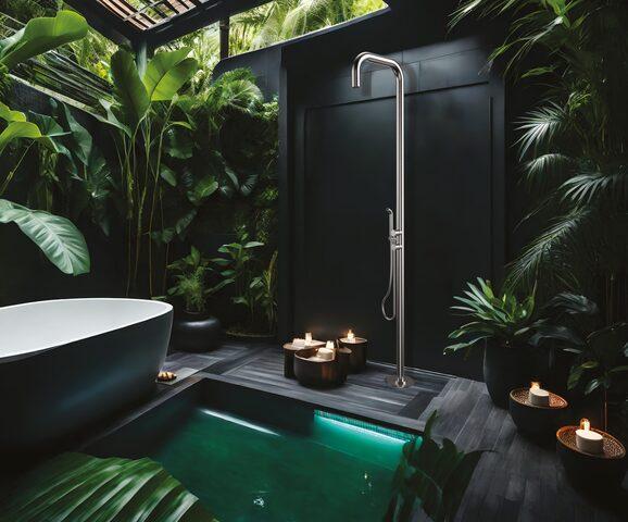
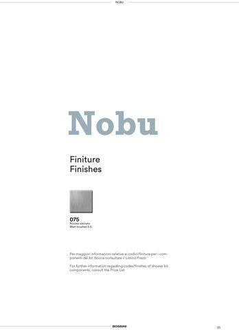
The minimalist design of the Nobu Line is based on elegance and essential Style. The stainless steel AISI 316L is an eco-friendly ... |
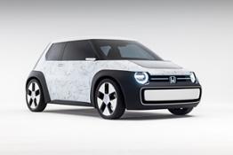
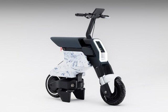
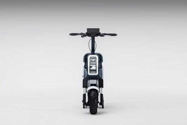
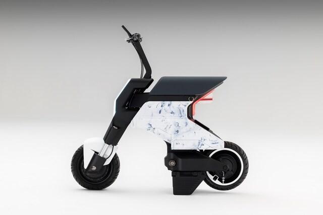
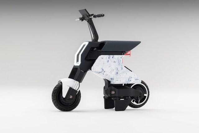
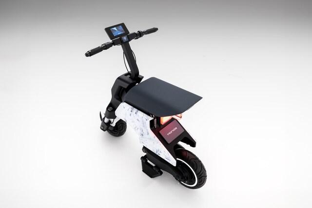
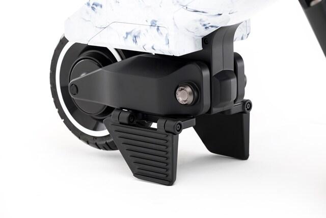
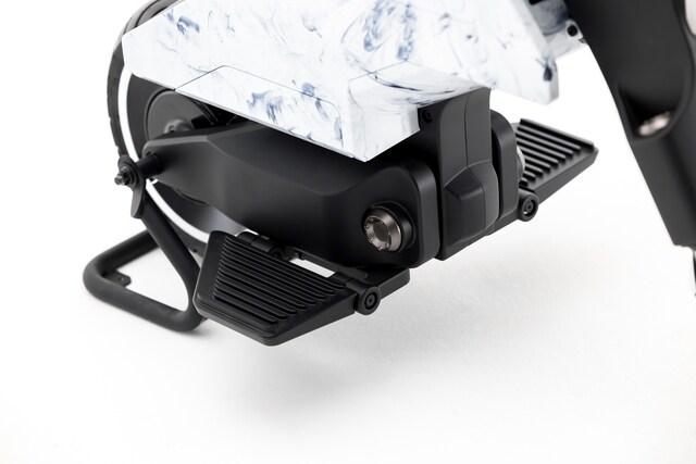
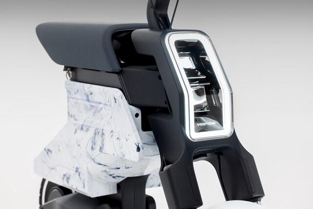
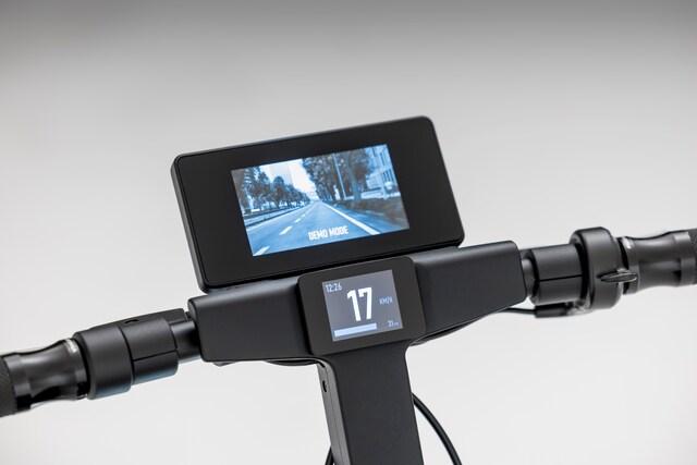
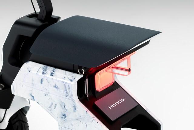
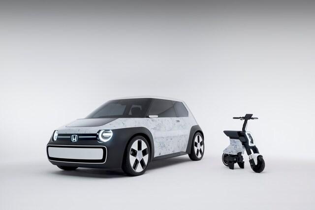
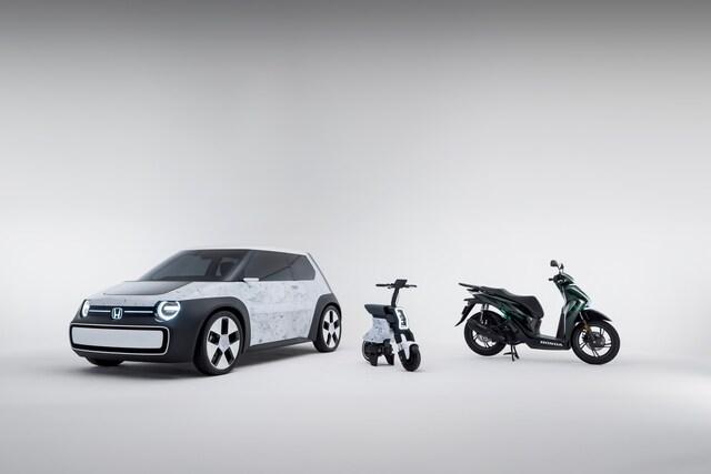
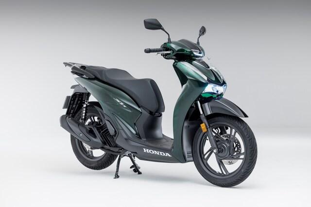
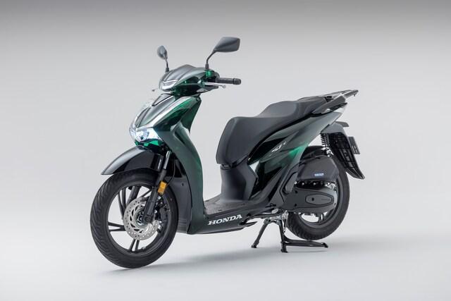
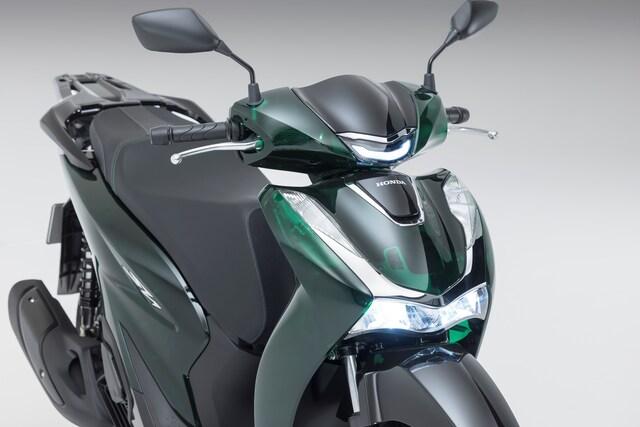
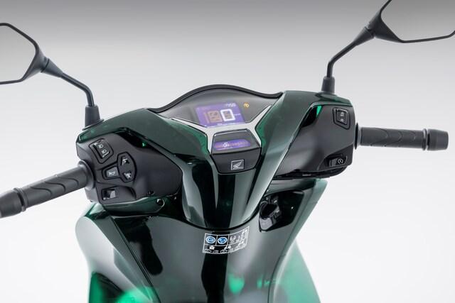
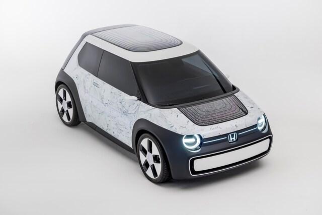
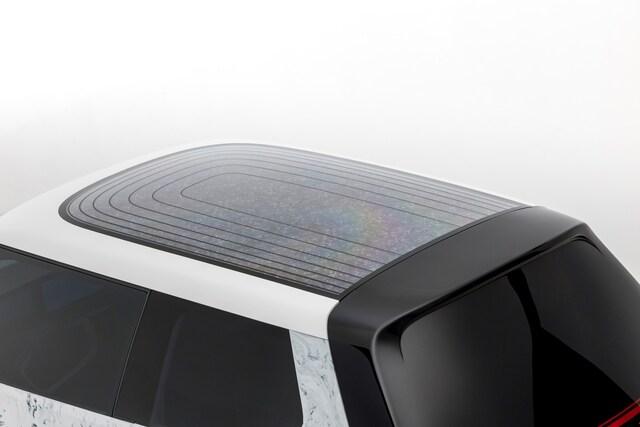
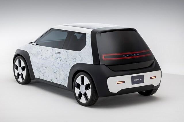
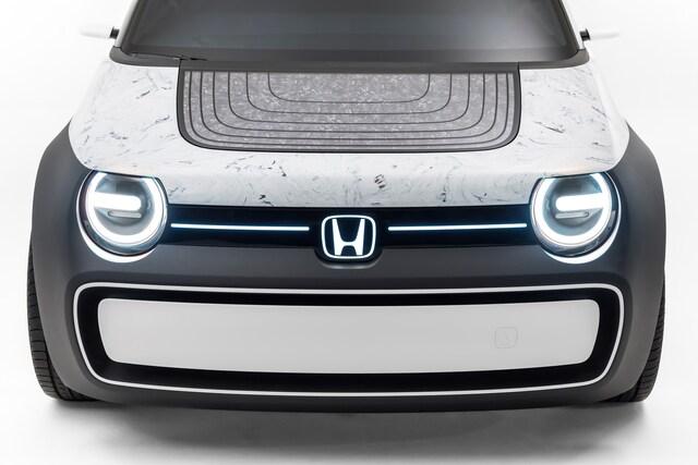
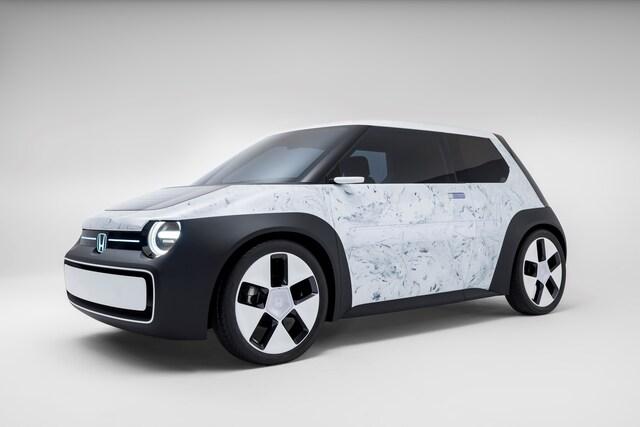
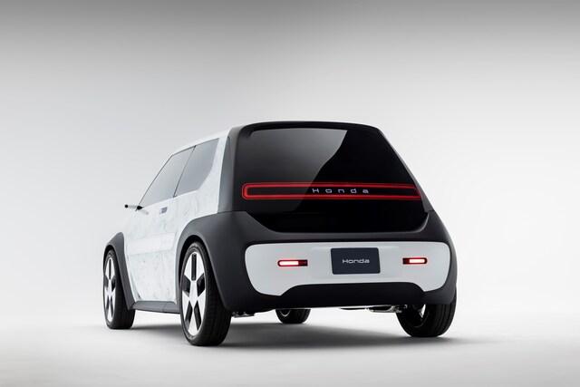
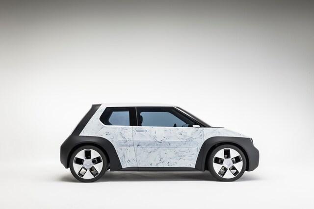
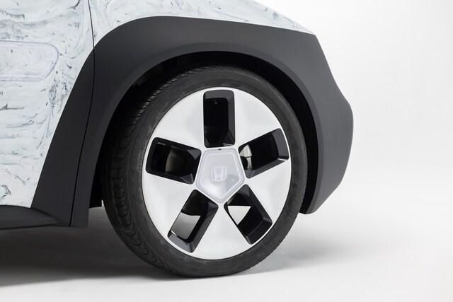
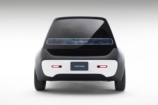
SUSTAINA-C Concept and Pocket Concept join production SH125i ‘Vetro’ scooter to demonstrate Honda’s evolving approach to more sust... |
© Copyright 2024


 Italian
  Share
Share Share via mail
  Automotive
 Sport
Sport Events
 Art&Culture
 Design
 Fashion&Beauty
 Food&Hospitality
 Technology
 Nautica
 Racing
 Excellence
 Corporate
 OffBeat
 Green
Green Gift
Gift Pop
Pop Heritage
 Entertainment
 Health & Wellness