


![]() Press release
Press release
16KB

Waseda University Rugby Football Club uniform15 ken shimizu
![]() 820x547, 396KB
820x547, 396KB
Waseda University Rugby Football Club logo
![]() 820x560, 88KB
820x560, 88KB
Waseda University Rugby Football Club uniform05 akihiro yoshida
![]() 820x547, 148KB
820x547, 148KB
Waseda University Rugby Football Club uniform04 akihiro yoshida
![]() 820x547, 125KB
820x547, 125KB
Waseda University Rugby Football Club uniform03 akihiro yoshida
![]() 820x547, 121KB
820x547, 121KB
Waseda University Rugby Football Club original goods06
![]() 820x547, 109KB
820x547, 109KB
Waseda University Rugby Football Club original goods05
![]() 820x547, 156KB
820x547, 156KB
Waseda University Rugby Football Club original goods04
![]() 820x547, 149KB
820x547, 149KB
Waseda University Rugby Football Club original goods01
![]() 820x547, 186KB
820x547, 186KB
![]() Press release
Press release
16KB
Related news |
||

|
|
|
june 07, 2022
|
july 28, 2021
|
june 24, 2019
|
|
The functional value of a table usually lies in the "top" of the tabletop, while its "bottom" serves as a supporting structure.Thi... |
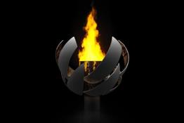
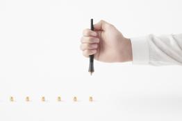
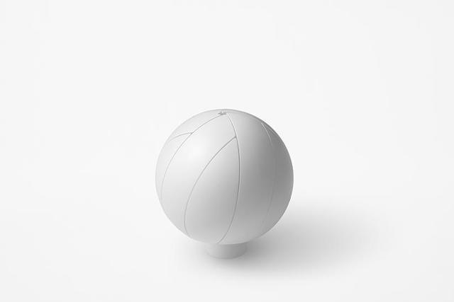
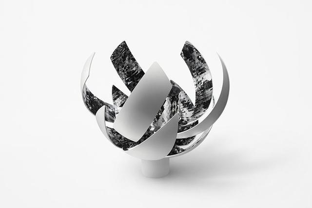
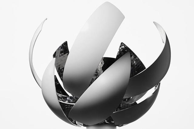
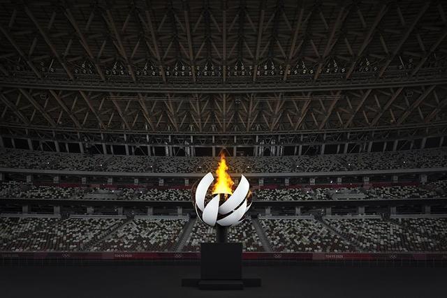
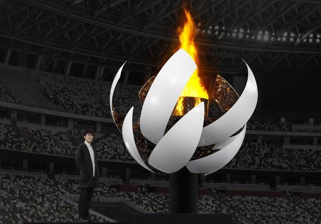
An Olympic Cauldron was designed based on the concept "All gather under the Sun, all are equal, and all receive energy" by Mansai ... |
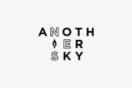
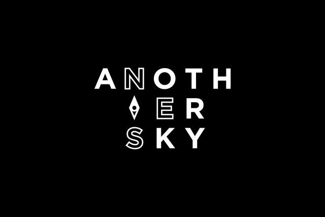
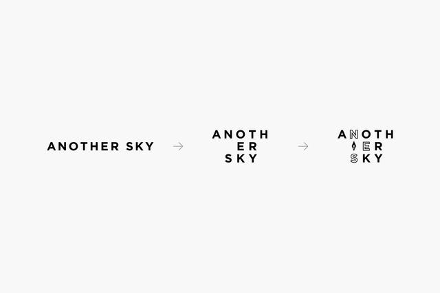
A new logo #design to accompany the renewed format of NTV's talkshow "ANOTHER SKY".In the previous format, guests were discussing ... |
You might be interested in |
||
|
|
|
march 20, 2019
|
january 23, 2019
|
may 16, 2018
|
|
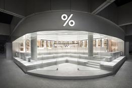
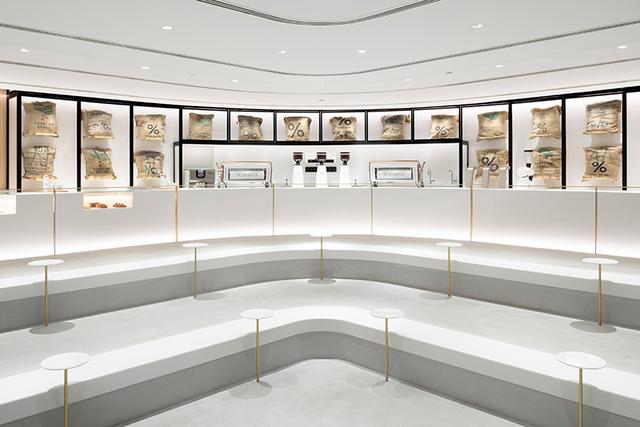
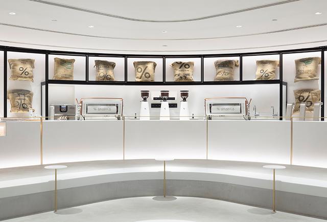
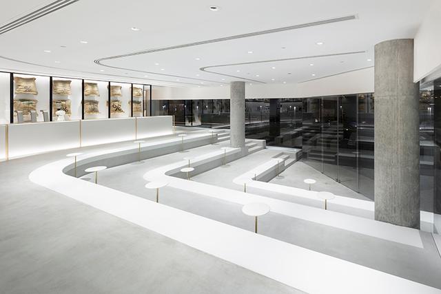
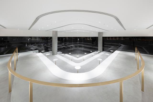
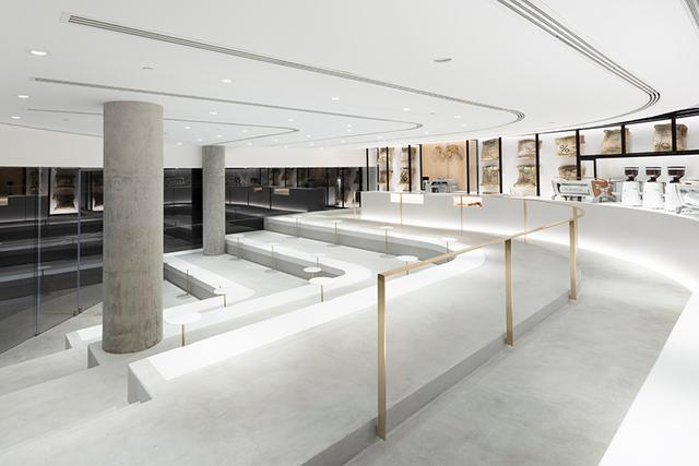
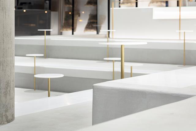
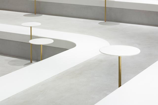
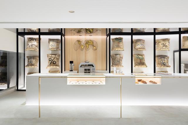
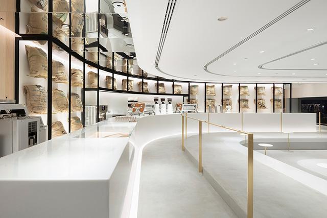
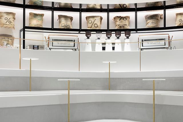
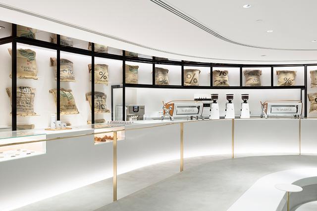
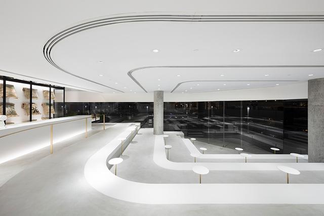
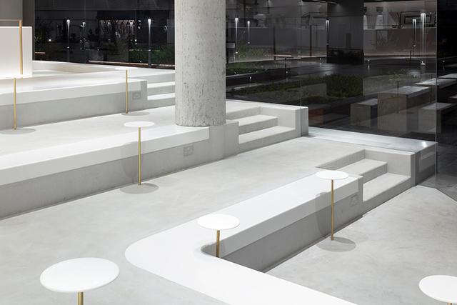
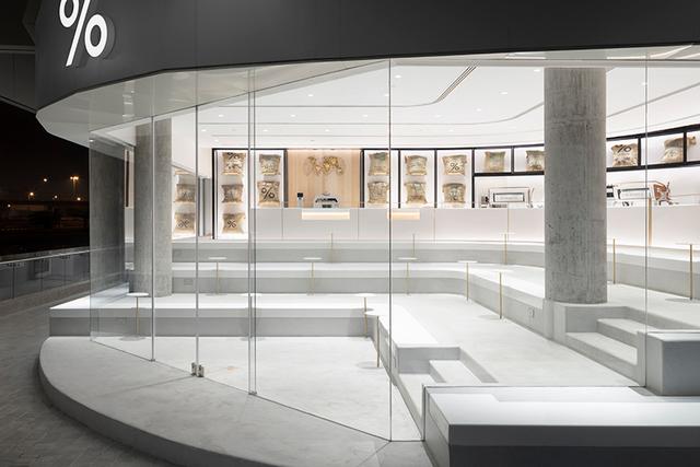
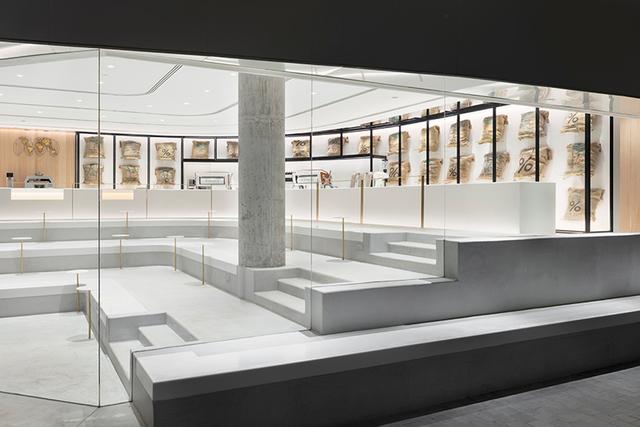
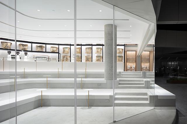
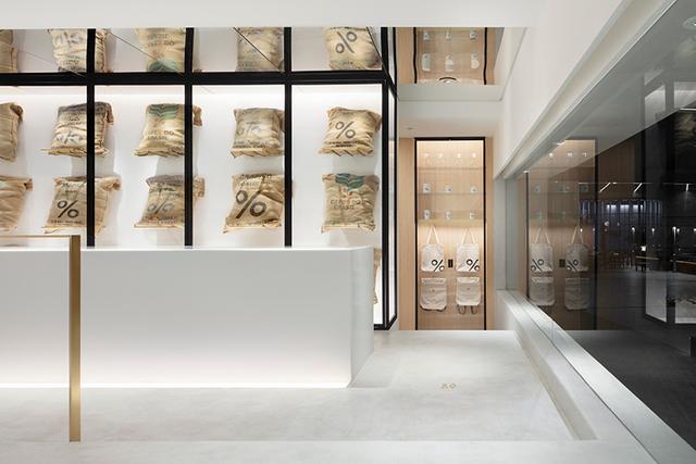
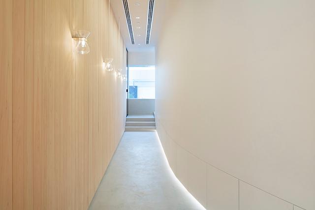
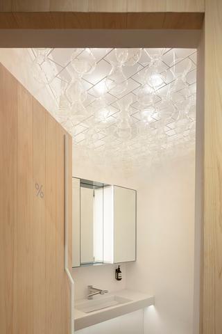
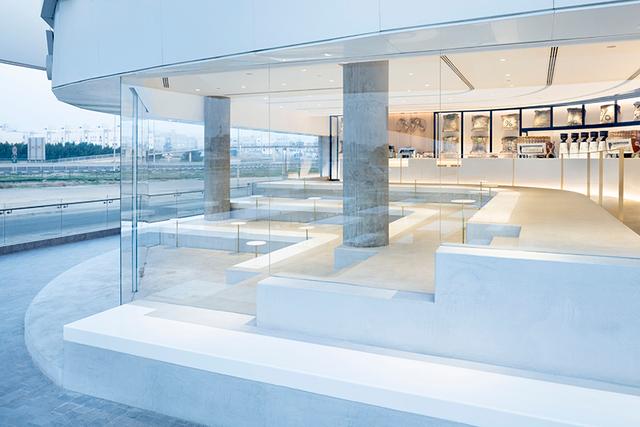
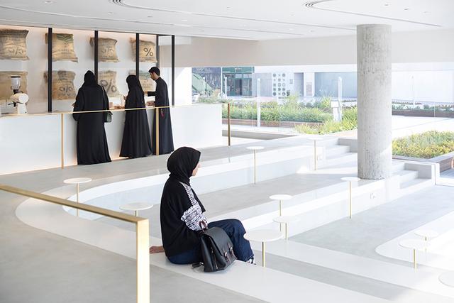
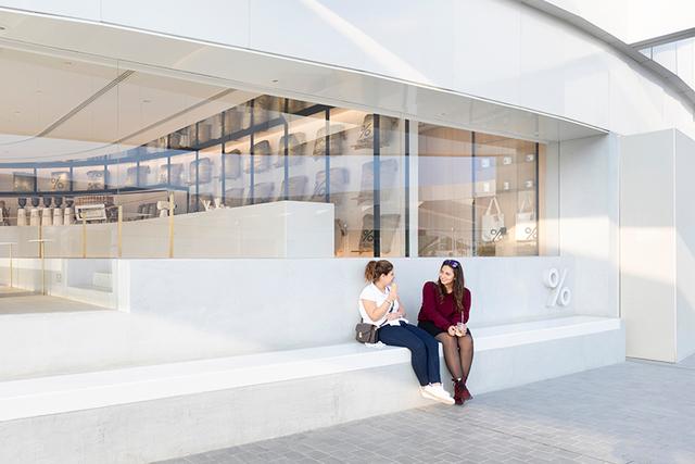
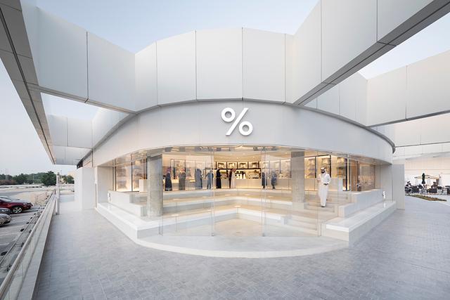
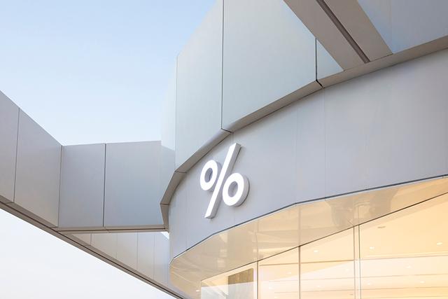
% #Arabica #Kuwait Abu Al HasaniyaInterior #design for "Arabica Coffee" located in the eastern coast of #Kuwait, a new branch for ... |
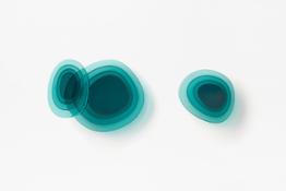
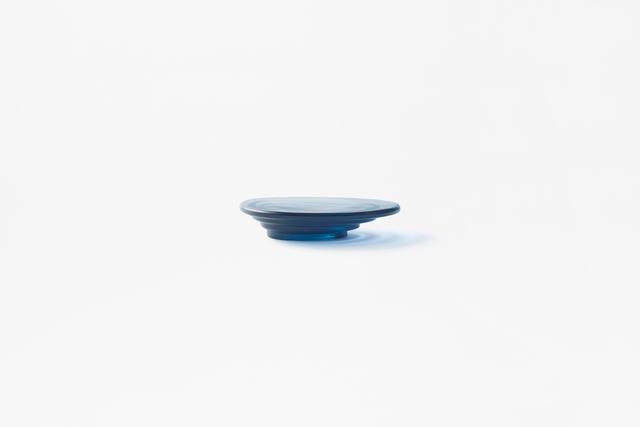
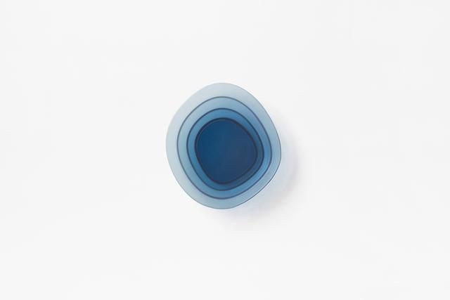
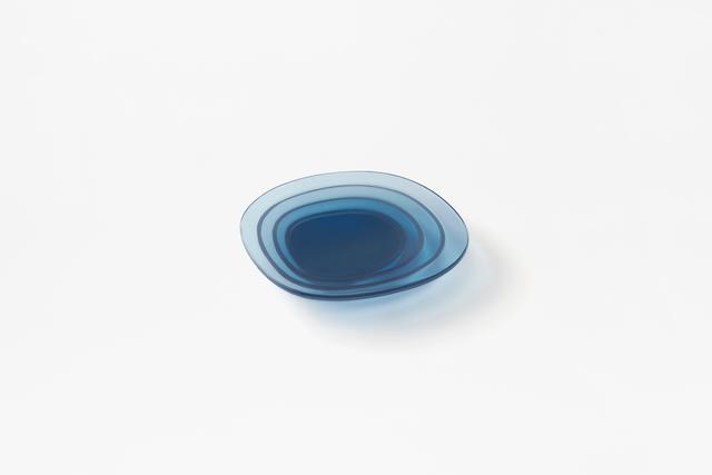
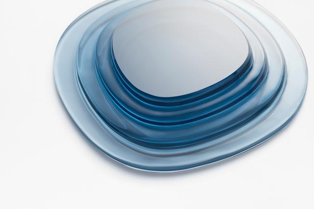
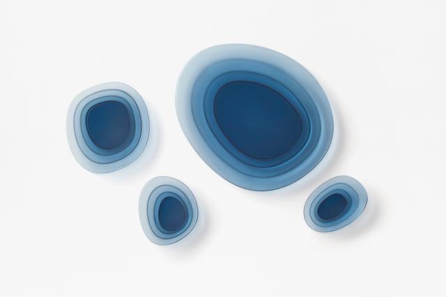
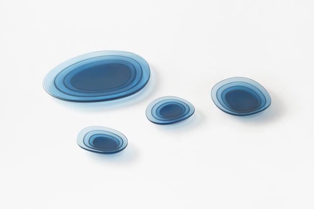
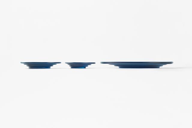
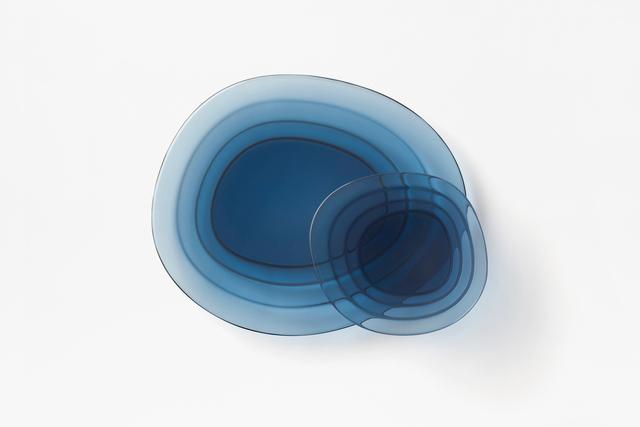
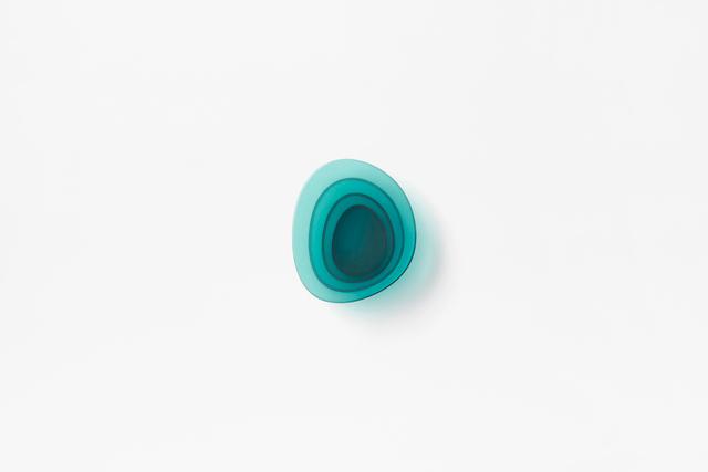
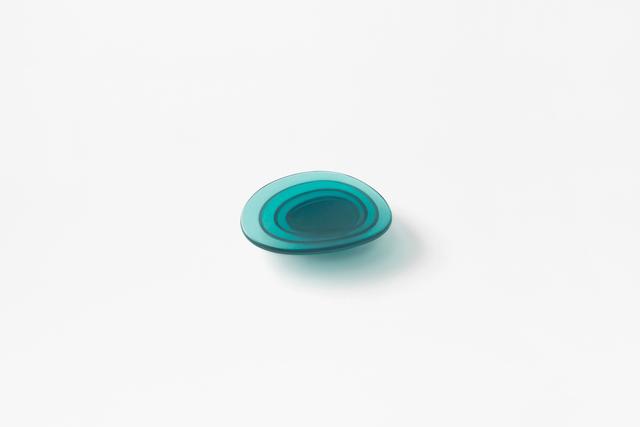
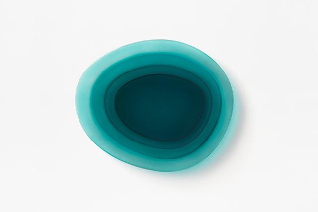
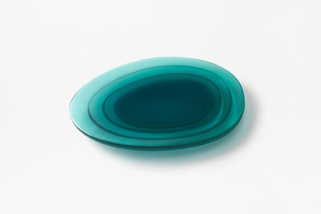
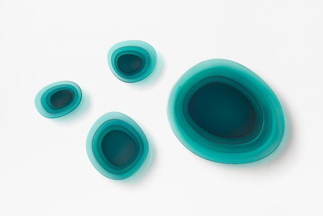
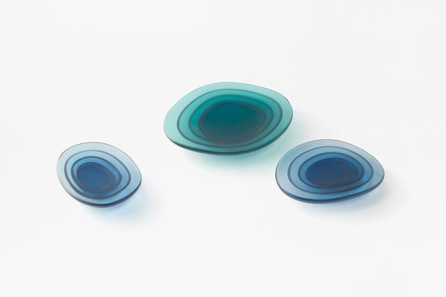
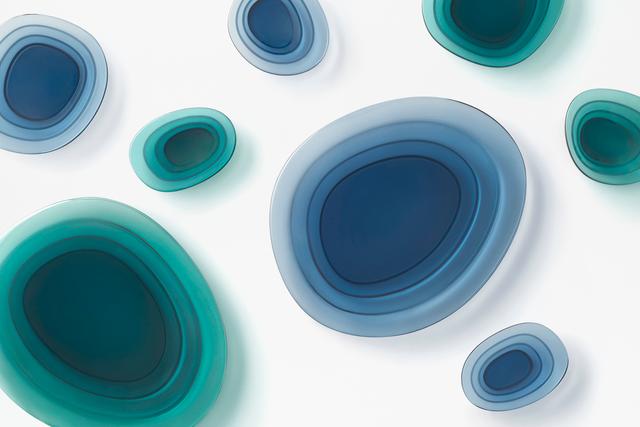
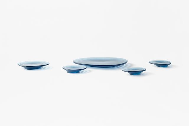
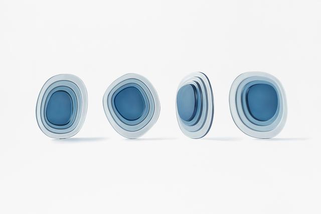
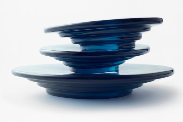
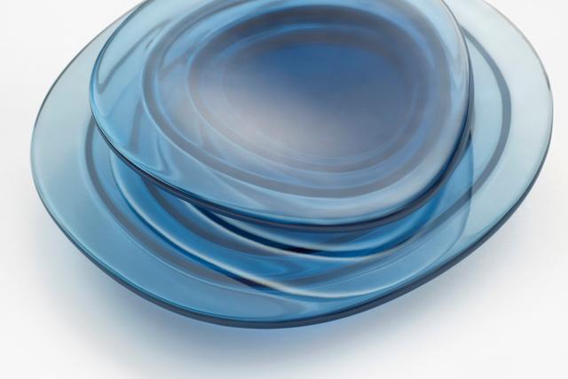
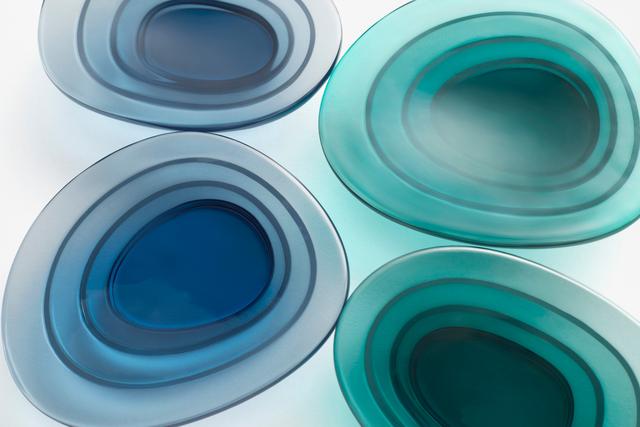
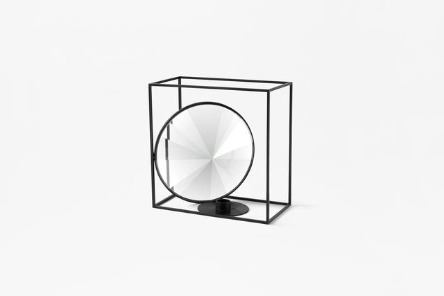
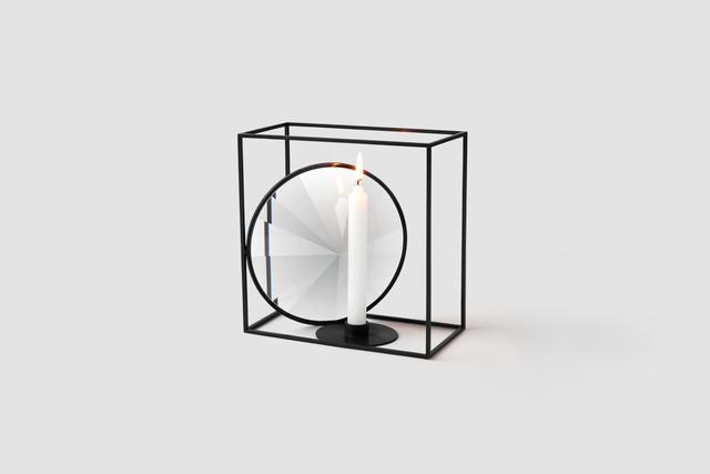
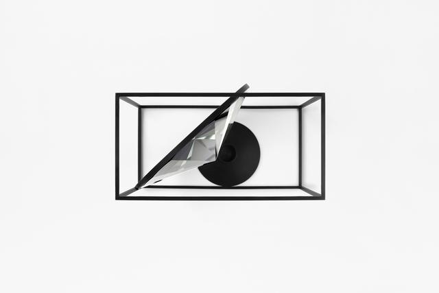
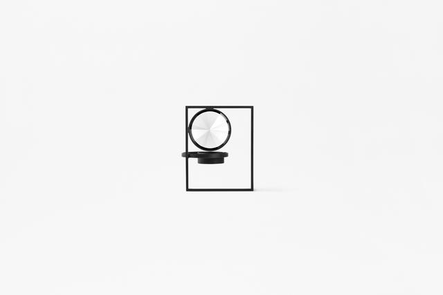
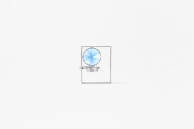
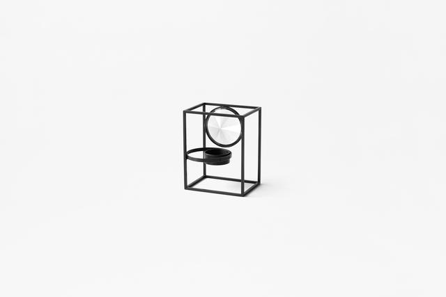
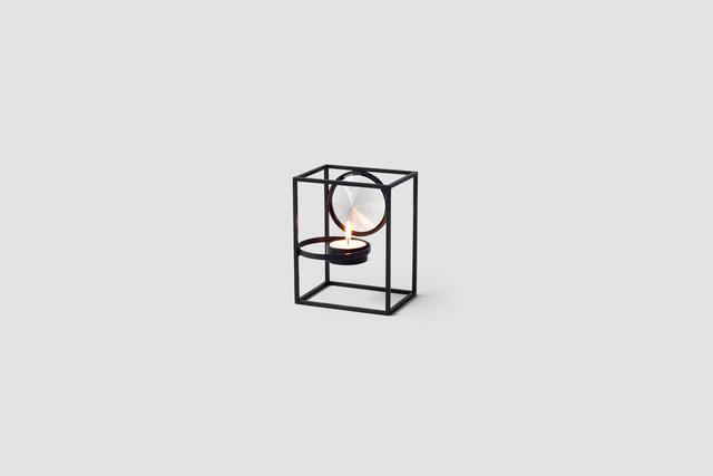
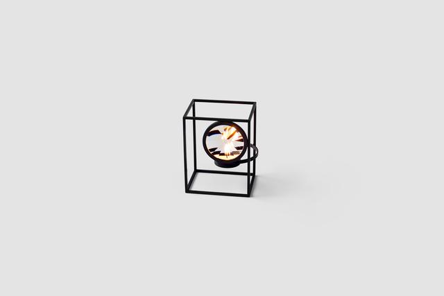
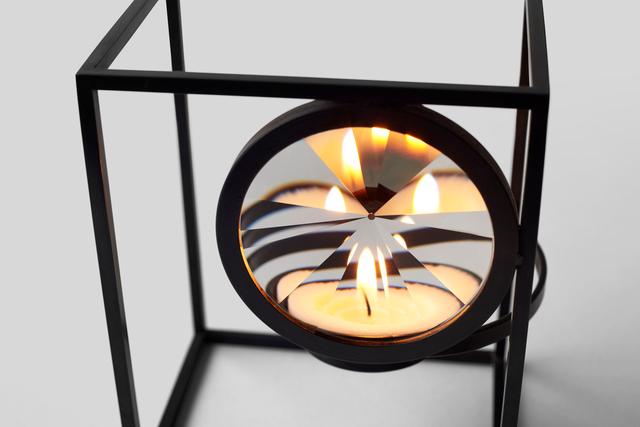
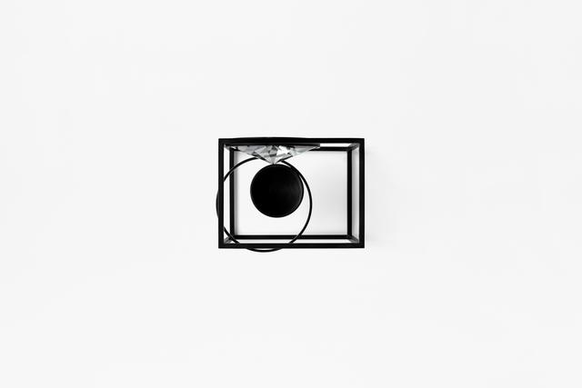
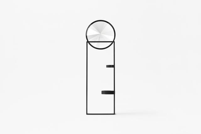
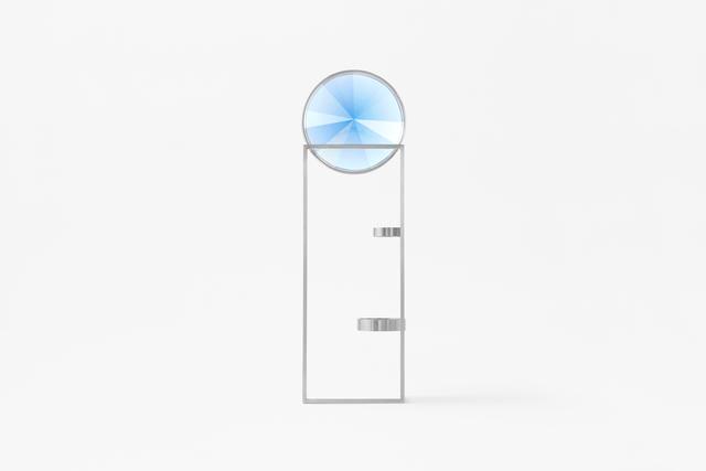
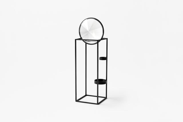
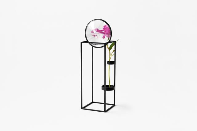
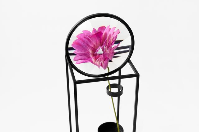
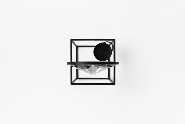
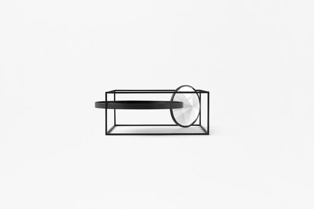
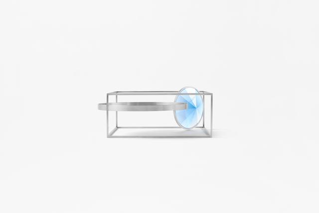
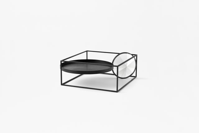
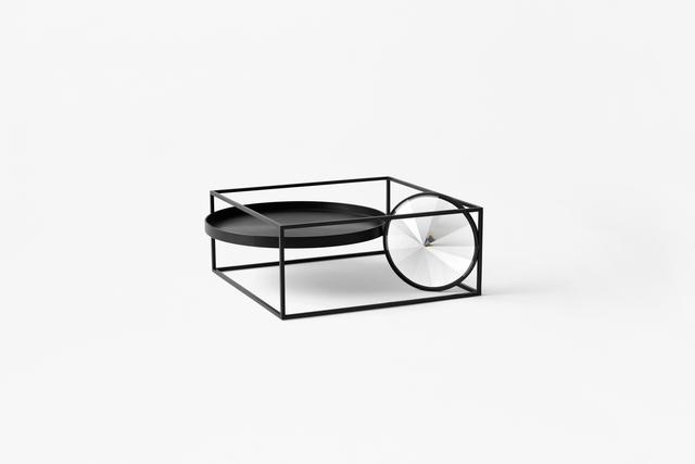
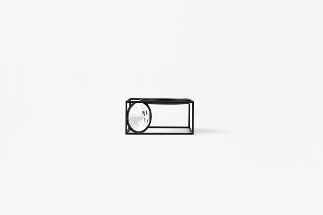
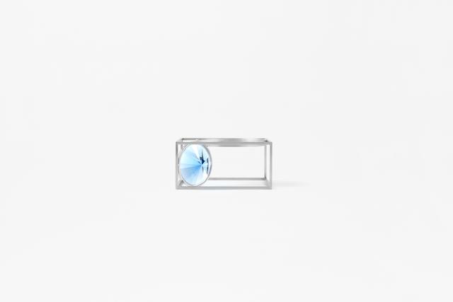
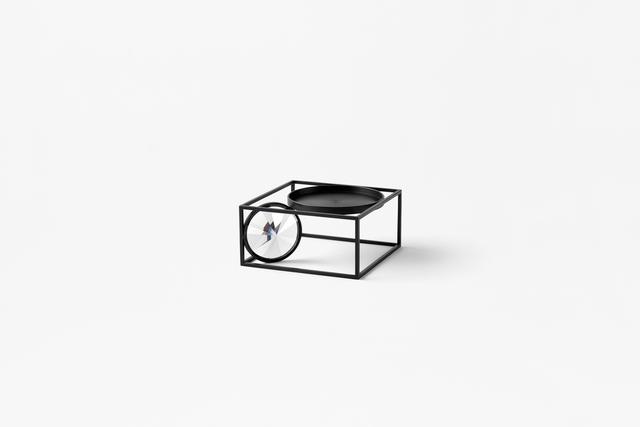
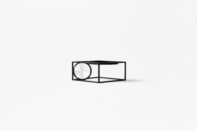
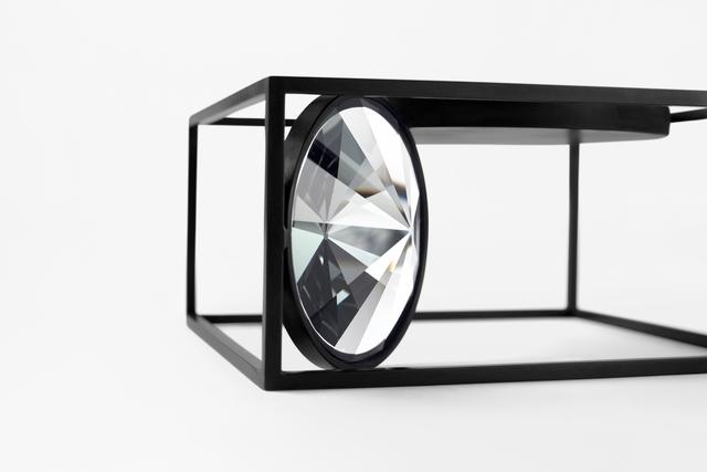
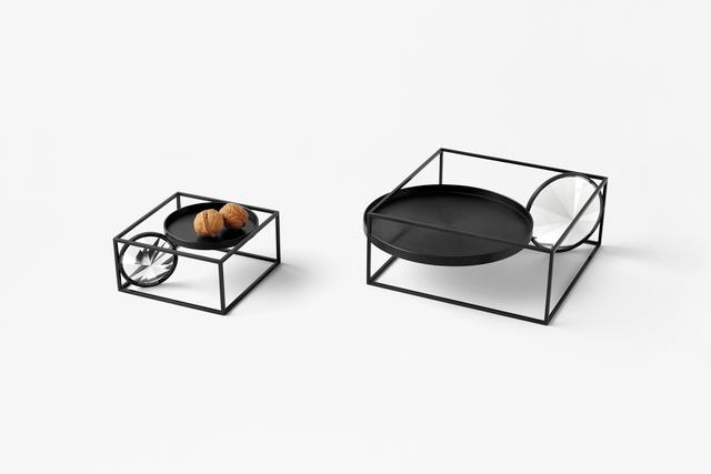
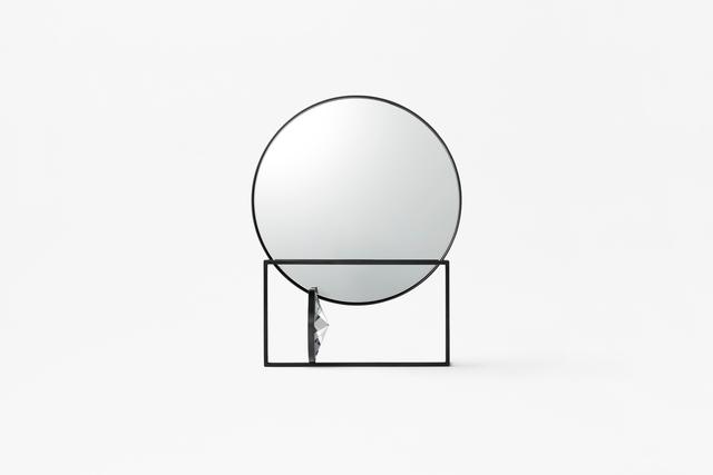
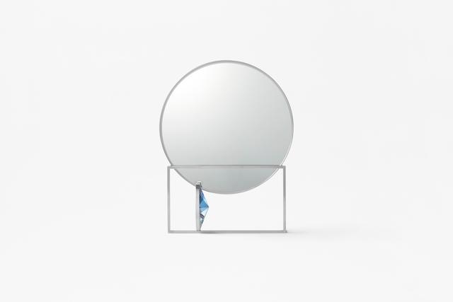
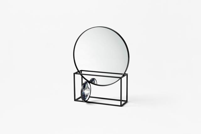
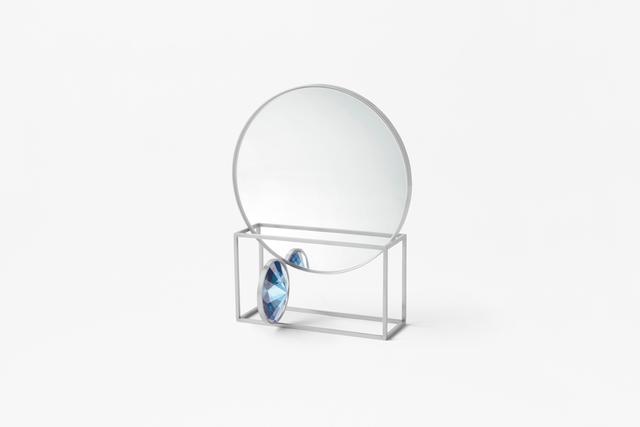
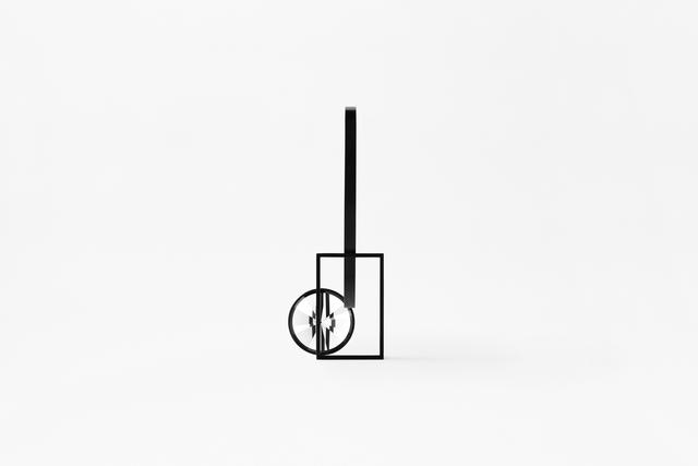
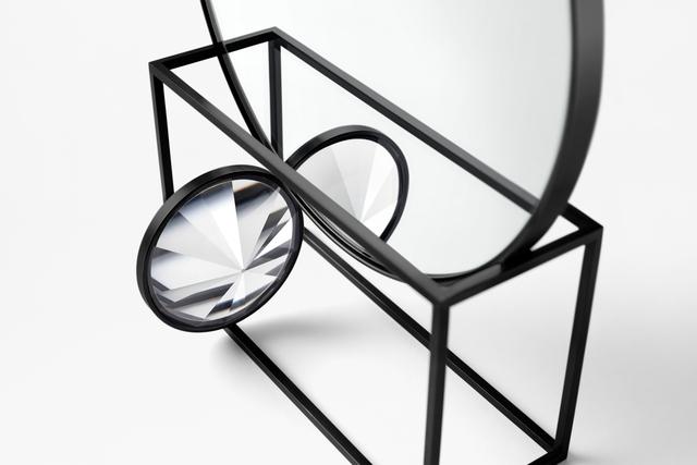
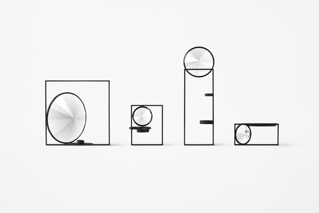
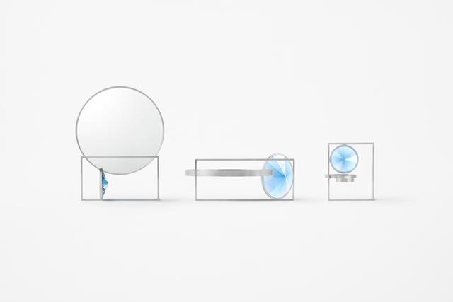
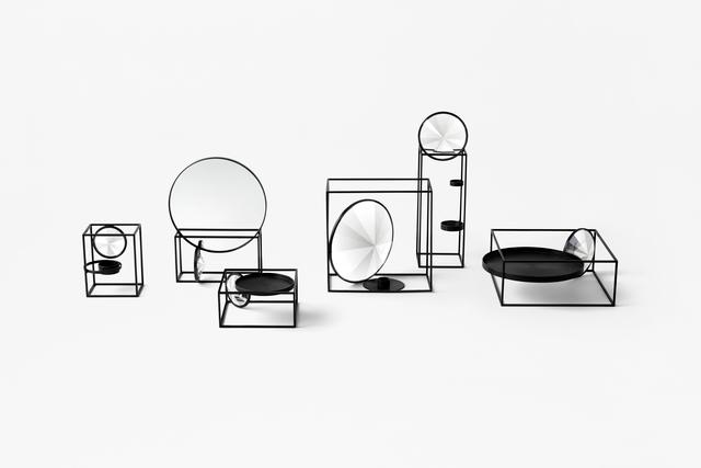
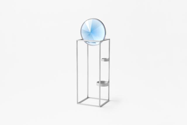
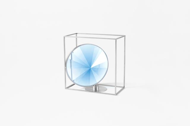
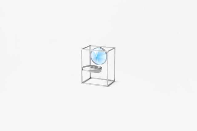
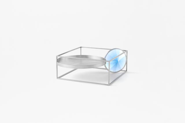
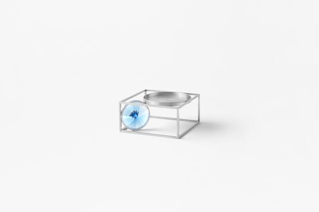
Press release available only in original language. soft pondA unique quality of flat-cut crystals, used for chandeliers and dresse... |
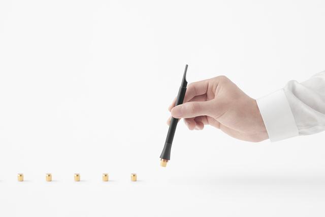
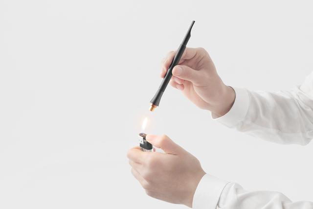
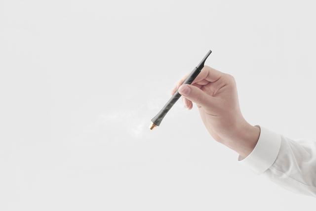
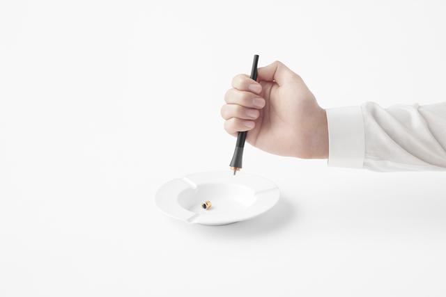
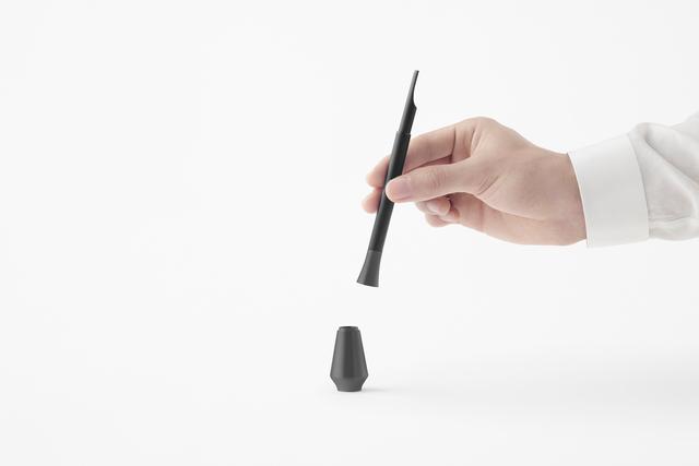
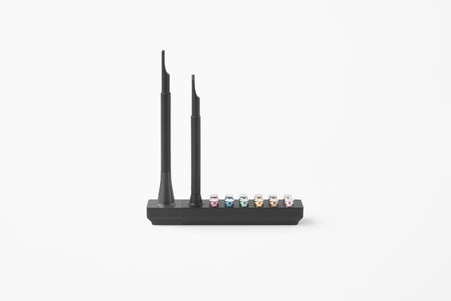
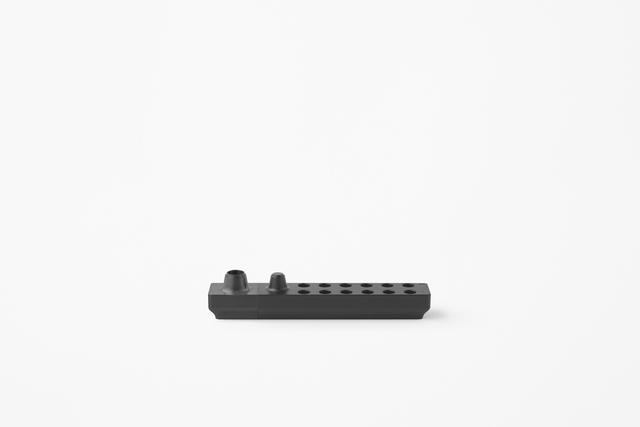
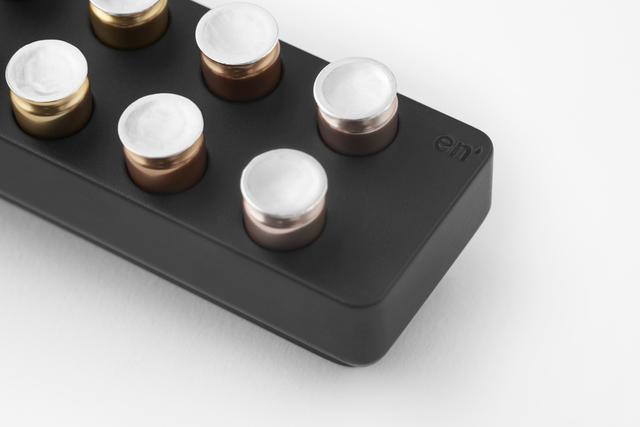
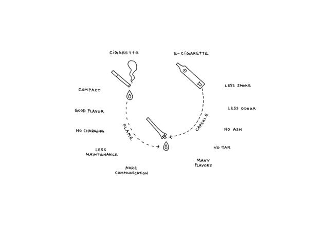
Within a market that is rapidly shifting to heated electronic cigarettes, the appeal of traditional cigarettes may have been lost.... |
© Copyright 2024


 Share
Share Share via mail
  Automotive
 Sport
Sport Events
 Art&Culture
 Design
 Fashion&Beauty
 Food&Hospitality
 Technology
 Nautica
 Racing
 Excellence
 Corporate
 OffBeat
 Green
Green Gift
Gift Pop
Pop Heritage
 Entertainment
 Health & Wellness