
![]() Press release
Press release
309KB
British hand-crafted artistry meets Italian wit and imagination in the latest volume of the enduring partnership between the #design house of Cole & Son and #fornasetti, the Italian atelier recognised for #design and decoration.
The collector’s curiosities are again transformed into distinguished wallcoverings. Fruits of nature in all their glorious forms take a flight of fancy into interior decor. Studies of nature from selections of shells to lush foliage, curious creatures, and the sky come together making the everyday spectacular
Artisans from both houses create a unique magic with endless creativity and a truly timeless aesthetic; every #design is effortlessly Senza Tempo.
DESIGNS
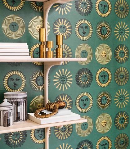
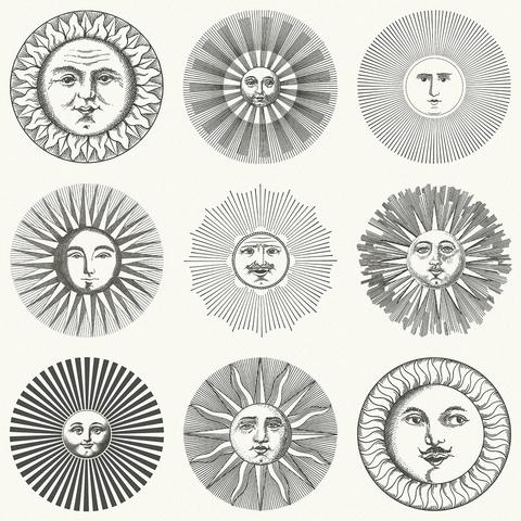
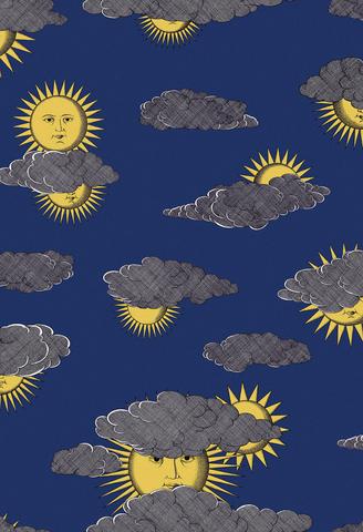
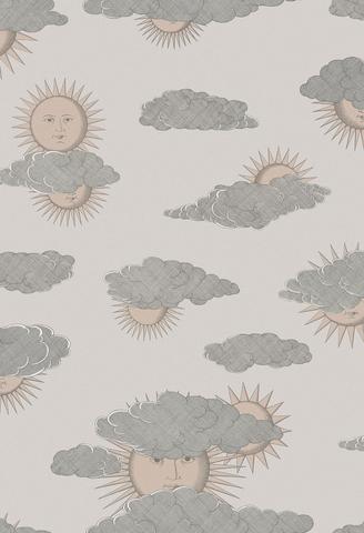
Soli e Nuvole
The inspiration of this print is ‘Sole di Capri’ a #design created by Piero #fornasetti in the 50s. Piero #fornasetti long had a passion for Capri and created this iconic #design from his imagination, before ever having visited the legendary island. Piero eventually took the family there on holiday and, during the 1960s, also opened a temporary #fornasetti boutique on the island. The original print is a combination of personified suns and stylized architecture, both typical of #fornasetti. The idea of pairing personified suns and clouds appears for the first time in a sketch for a headscarf that Piero drew in 1950. It is now a whimsical all-over print, bringing a unique quirk to an interior.
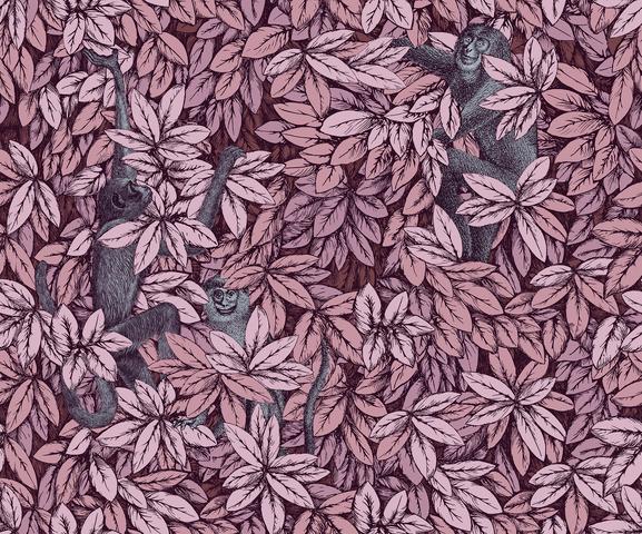
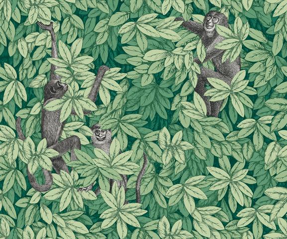
Foglie e scimmie
Monkeys appear throughout the Milanese Atelier’s work and, for the first time, are available emerging from the dense foliage of Chiavi Segrete. The playful composition of flora and fauna is quintessential #fornasetti, with the delicate organic study juxtaposed by the hiding primates. Available in subtle tones of old olive, as well as rich autumnal and verdant green palettes, Foglie e scimmie is natural progression of many of the Atelier’s prolific themes.
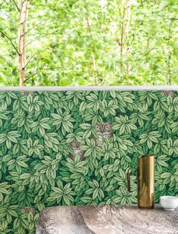
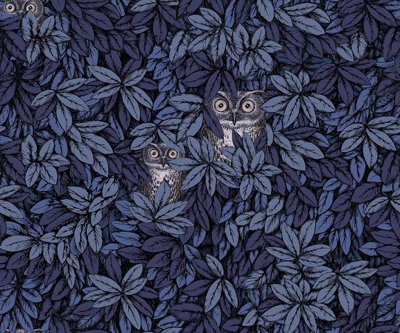
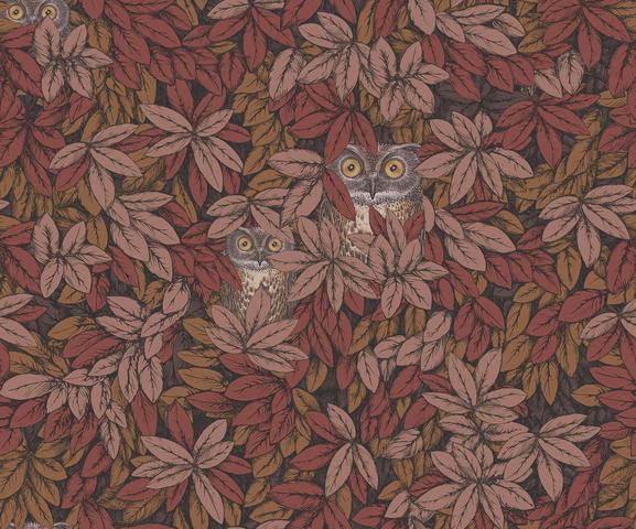
Foglie e civette
The owl, forever associated with darkness and gloom, can see and move deftly in the dark, hence its symbolism as the embodiment of wisdom and foresight. This ambivalent and mysterious symbol fascinated Piero #fornasetti, who used it as a motif on numerous accessories and porcelain items.
The animal kingdom has long populated Fornasetti’s imagination and enriches this wallpaper with watchful owls nestled amongst a thick mantle of Chiavi Segrete leaves in tones of rich sapphire and citrine, as well as the softer stone and spring-like leaf greens.
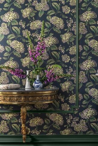
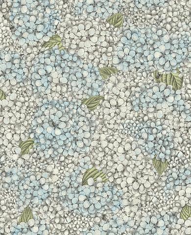
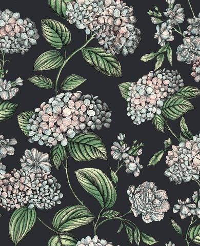
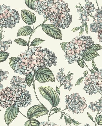
Ramo di Ortensia
The ‘Ortensie’ #design is based upon the abundant hydrangea bushes that grow in the garden that surrounds the #fornasetti house in Milan. Piero #fornasetti created this #design in the 50s applying it to numerous tables and trays.
The idea to use hydrangea leaves came to Piero thanks to his son Barnaba. At 3 years old he brought one of the plant’s leaves with a small daisy on it from the family garden as a gift for his father. The #design captures the lush sprawling trails of this blousy plant and its redolent summer fragrance.
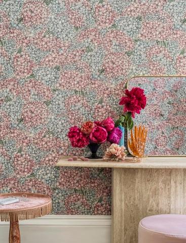
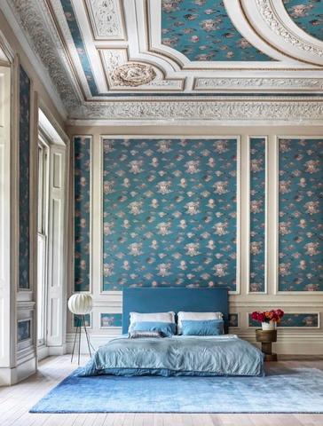
Ortensia
Stemming from the original ‘Ortensie’ #design, Barnaba #fornasetti created a dense bouquet of petals with bees that at first covered a scarf and furniture of the Atelier. This bounteous floral print is full of life, drawing you into the garden and filling your thoughts with the sweet smells and sounds of summer. Soft pastels are reminiscent of organic Ortensia hues, whilst a simple monochrome accentuates the delicately detailed linework of this expansive #design.
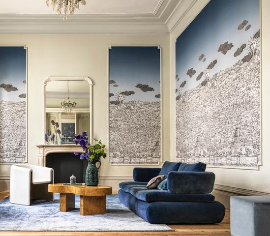
Vista Mediterranea
A flight beyond the limits of the imagination lead #fornasetti to an enchanted, hypnotic Jerusalem. Multiple points of view overlap, with different architectural styles chasing each other in a continuous pattern. The precise black line of the buildings interprets a boundless imagination, creating an intriguing texture. The first dreamlike journey of this #design took place on the ‘Gerusalemme’ wallpaper designed by Piero #fornasetti for the entrance hall of his Milan residence at the end of the 1940s. It was then later extended to trays, magazine racks, lamps, and pieces of furniture. A shining sun, peeking through the clouds, was added to the landscape in the early 90s, adding another fanciful element to this sprawling print.
A bright cerulean sky gives way to a deep tanzanite as the scene is taken from day to night, with the introduction of a lustred mica for this midnight palette bringing the most subtle details to the fore.
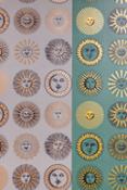
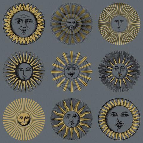
Soli
A classic of the Atelier’s portfolio, the sun occupies a privileged position in the #fornasetti repertoire of natural forms and is one of the major motifs in the Atelier's visual universe. A predilection in part justified by the fact that for years in the early 1940s, at the request of Gio Ponti, Piero #fornasetti designed almanacs on a lunar theme to be given as Christmas gifts.
There are several variations of this star within the #fornasetti universe, from fabrics to porcelain, accessories, and pieces of furniture.
Presented as a striking repeat of shining faces, Soli’s colour palettes range from a strikingly simple monochrome to a rich emerald green with radiant golden suns.
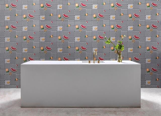
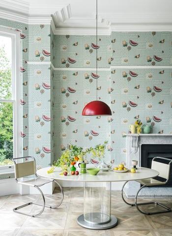
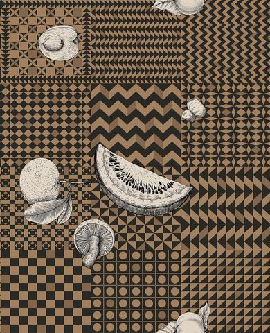
Frutta e Geometrico
Every single image is a source of inspiration, a starting point that may lead to infinite variations. This is the very principle on which most of Piero Fornasetti’s work relies. Fruit has prominently sat amongst his themes and designs since the 1940s and are present on many atelier items.
The clear-cut graphic lines infuse this arresting wallpaper with Fornasetti’s unmistakable signature style and timeless allure. The trompe l’oeil effect enhances the contrast between the rigorous geometry of the base and the organic shapes of different fruits found in nature.
Each of Frutto e Geometrico’s colourways provide a variation on this unique combination or structure and organic shape. Choose from chessboard black and white, to the softest mint pastels, or a dusk lilac grey.
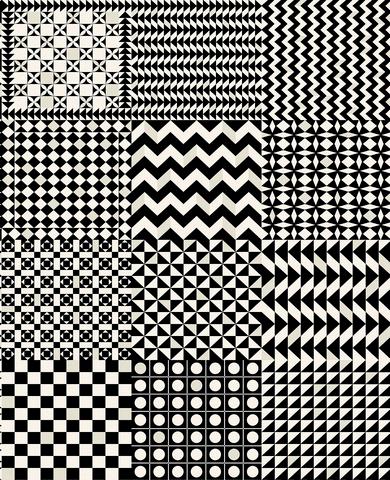
Geometrico
Piero #fornasetti first used this motif in 1954 for the decoration of his ‘Geometrico’ screen. Variations on the chessboard theme and perceptual illusions play with the contrast between black and white. A foray into abstract, minimal, contemporary art, without sacrificing the eccentric #fornasetti spirit.
Combine with Frutto e Geometrico for an extension of the #design with added whimsy or use in insolation for a masterclass in bold geometry.
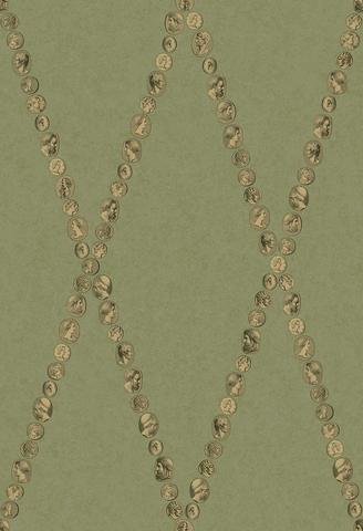
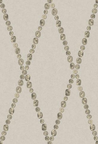
Cammei
Piero #fornasetti was the consummate collector with a plethora of cameos certainly forming part of his vast collection of curiosities. The Cammei theme is dear to #fornasetti and is an homage to Classicism.
This elegant #design has been used on a multitude of #fornasetti pieces: from teacups and other ceramic pieces to trays and screens. It has also proved very successful on tabletops, so much so that #fornasetti has produced several variations and colour combinations over the years.
Evoking a visual universe that mixes various eras, this wallpaper illuminates a room with an eternal beauty.
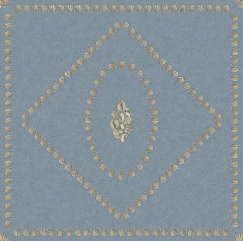
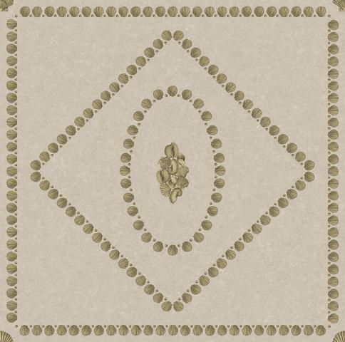
Conchiglie
Fornasetti used shells to cover the walls of his Lake Como villa dining room, as a mid-century interpretation of a sixteenth-century grotto. The room also featured a delicate shell ceiling lamp made by Giulia, Piero’s wife.
This motif can be seen across many of the atelier’s pieces from headscarves and vases to trays, mirrors, and tables; #fornasetti inspiration knows no creative bounds.
Forming a geometric repeat of shell-laden boxes and diamonds, Conchiglie is full of exquisite detail, providing new inspiration every time the #design is viewed.

Cole & Son Fornasetti Senza Tempo vol II - Ortensia
![]() 5464x8192, 11MB
5464x8192, 11MB
Cole & Son Fornasetti Senza Tempo vol II - Soli
![]() 5464x8192, 13MB
5464x8192, 13MB
![]() Press release
Press release
309KB
Related news |
|
june 19, 2023
|
|
British hand-crafted artistry meets Italian wit and imagination in the latest volume of the enduring partnership between the #desi... |
© Copyright 2024


 Italian
  Share
Share Share via mail
  Automotive
 Sport
Sport Events
 Art&Culture
 Design
 Fashion&Beauty
 Food&Hospitality
 Technology
 Nautica
 Racing
 Excellence
 Corporate
 OffBeat
 Green
Green Gift
Gift Pop
Pop Heritage
 Entertainment
 Health & Wellness