


![]() Press release
Press release
1MB
Comunicato Stampa disponibile solo in lingua originale.
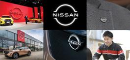
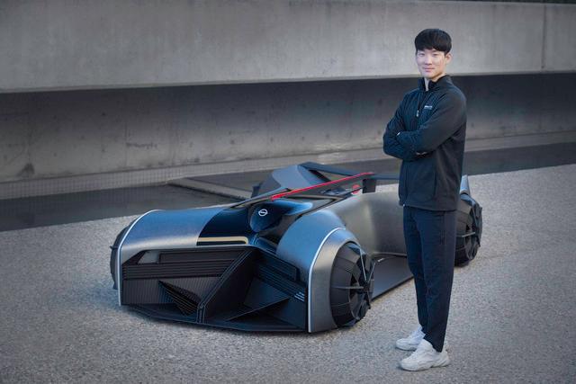
Automotive design isn’t just about vehicle bodies
When you think of a designer working for a car company, the first thing that comes to mind may be a person making sketches of vehicle bodies. In reality, automotive designers work on a multitude of things – from car emblems to logos, motor show booths, dealerships, company uniforms and more. The scale and materials vary widely, but everything fits together as part of a unified brand identity.
"We design things with all sorts of different materials and sizes, but the basic idea – trying to give shape to the brand's spirit and identity – is the same," says Nissan designer Hiroyuki Sakurai.
Designing spaces
At Nissan, dedicated designers work on buildings and spaces such as company buildings, motor show booths and dealerships.
"We often apply elements from cars to space design," Sakurai says. "The Nissan Pavilion event space, where we unveiled the new Nissan Ariya electric crossover last year, incorporated elements of the Ariya's design – a contrast between tradition and innovation."
Showcasing cars in the digital age
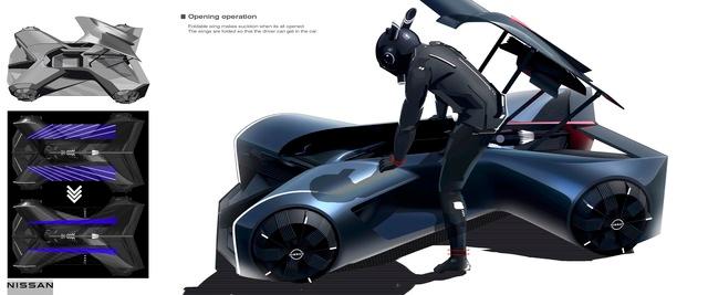
Designers are also increasingly inspired by the intersection of physical and virtual experiences. "We're trying to blaze a new path by offering novel experiences, such as driving a heritage car, or a futuristic car that hasn't been made yet," Sakurai says. "Virtual reality devices are increasingly used for both car design and space design. For instance, we can use a VR headset to change the time, the season and the lighting. This is because the external ambiance is part of how we experience a car."
Car emblems
As the "face" of a car, badges and emblems are key to a carmaker's identity. In addition to the company badge – in Nissan's case, spelling out the company name – there are also emblems naming the model and signifying the specification or grade. Each is created by dedicated designers to fit the specific model.
Changing with the times
Until around the 2000s, fonts and decorations of Nissan's car emblems varied from model to model, depending on the character of each car. Emblem designer Naoki Yamamoto was captivated by the elegant emblems of high-end cars when he first joined Nissan.
"The 1990s was a time when customers preferred colorful, decorative emblems," he says. "For instance, the Cedric and Gloria at the time had beautiful, cursive-lettered emblems with a golden fringe."
In 2001, Nissan decided to unify the brand's global identity. Fonts, colors, the surface finish and position of emblems were made almost the same. Within the unified rules, designers could still decide on details such as size and the precise position for each model.
Z and GT-R
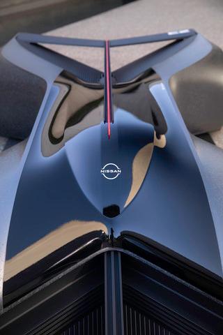
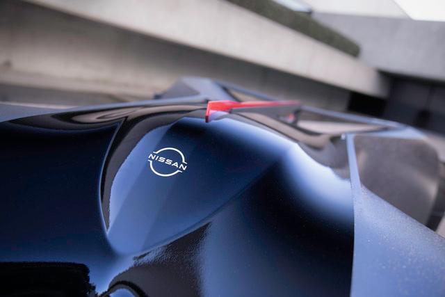
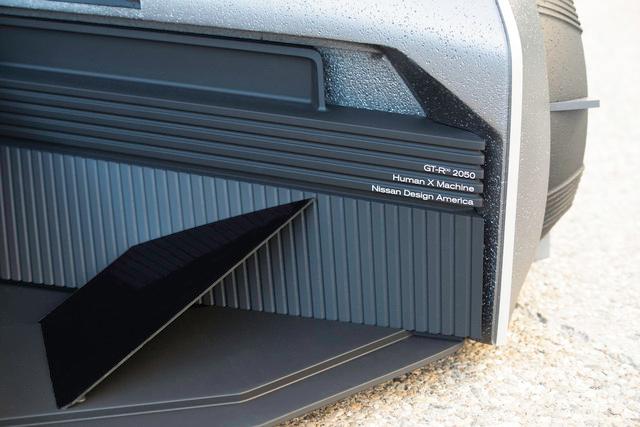
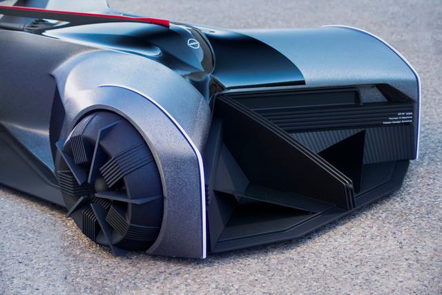
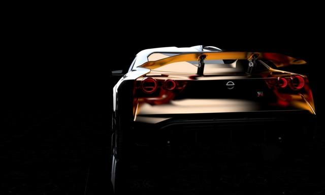
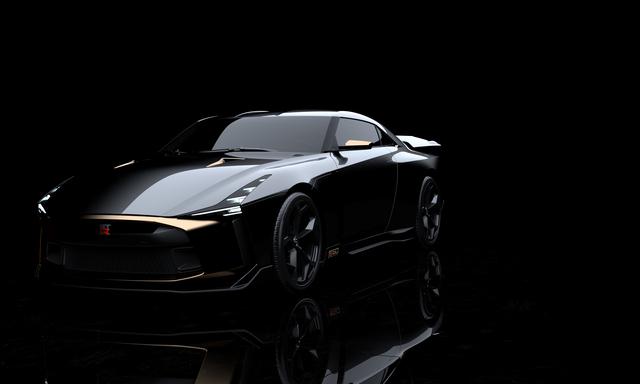
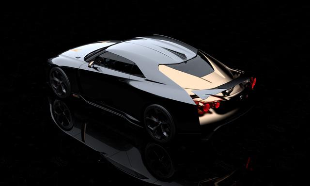
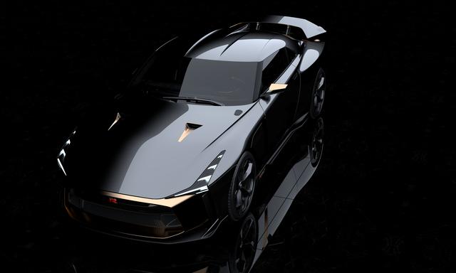
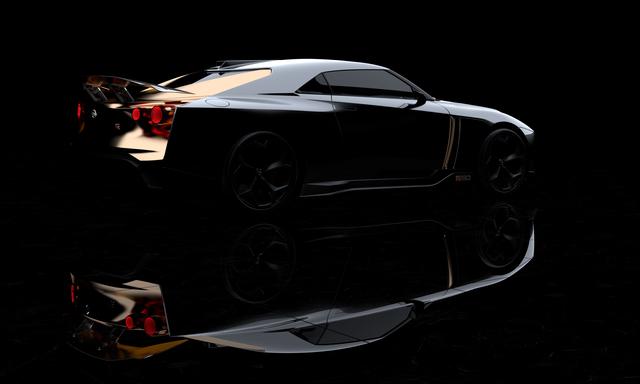
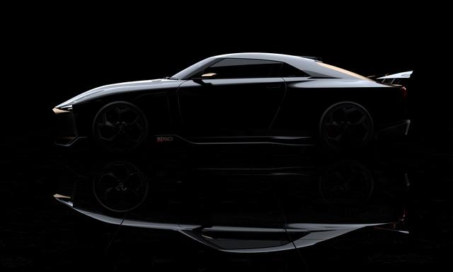
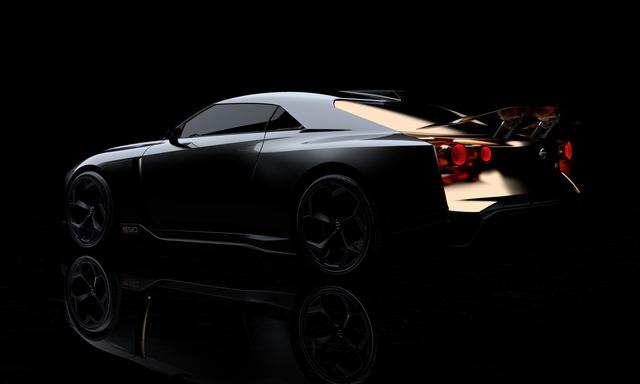
The Nissan Z and GT-R, however, continued to have special emblems. Last September, the company unveiled the Z Proto, a prototype of the next-generation Z car. The Z Proto's diagonal, cursive-lettered emblem is a homage to the first-generation Z. The circled "Z" emblem on the side has also been handed down for generations. Meanwhile, the GT-R uses an emblem with the letters "GT-R" and vivid red color. This font is also unique to the GT-R.
New car badge and font
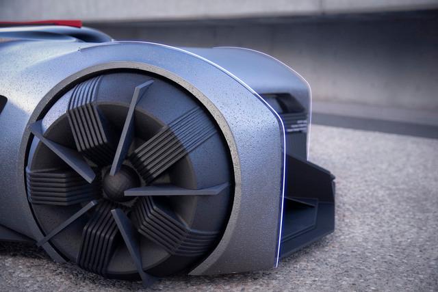
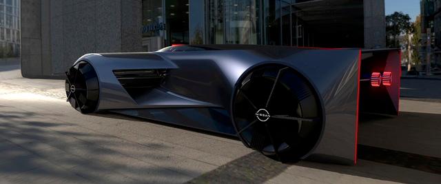
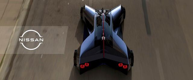
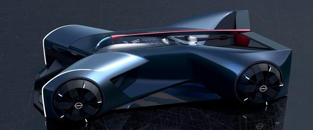
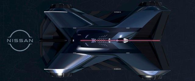
Along with introducing Nissan's new brand logo, the Ariya also ushered in a new standard font for emblems, with a new color, luster and cross‐sectional shape. The "Nissan" badge in front also features an illuminated design, specifically designed to give our electric vehicles a more futuristic appearance.
The brand's new identity is being brought to life by designers like Sakurai and Yamamoto, as they reimagine the spaces and new emblems that represents the new chapter for Nissan.

ea69c2b048ecb892dae03ac550b976cd00bba353
![]() 1300x600, 519KB
1300x600, 519KB
story-210222 01
![]() 1100x733, 552KB
1100x733, 552KB
story-210222 02
![]() 1100x733, 461KB
1100x733, 461KB
story-210222 03 rev
![]() 1100x733, 639KB
1100x733, 639KB
story-210222 04
![]() 1100x733, 436KB
1100x733, 436KB
story-210222 05
![]() 1100x619, 437KB
1100x619, 437KB
story-210222 06
![]() 1100x733, 435KB
1100x733, 435KB
story-210222 07
![]() 1100x733, 363KB
1100x733, 363KB
story-210222 08
![]() 1100x733, 484KB
1100x733, 484KB
story-210222 09
![]() 1100x733, 745KB
1100x733, 745KB
story-210222 10
![]() 733x733, 155KB
733x733, 155KB
story-210222 11
![]() 1100x733, 447KB
1100x733, 447KB
![]() Press release
Press release
1MB
News correlate |
|

|
|
dicembre 17, 2020
|
giugno 29, 2018
|
|
Comunicato Stampa disponibile solo in lingua originale. Nissan creatives mold a 1:1 model based on a senior design student’s visio... |
YOKOHAMA, Giappone/TORINO, Italia (29 giugno 2018) – Nissan e Italdesign hanno creato un nuovo prototipo, Nissan GT-R50 by Italdes... |
© Copyright 2024


 Inglese
  Condividi
 Condividi via mail
  Automotive
 Sport
Sport Events
 Art&Culture
 Design
 Fashion&Beauty
 Food&Hospitality
 Tecnologia
 Nautica
 Racing
 Excellence
 Corporate
 OffBeat
 Green
Green Gift
Gift Pop
Pop Heritage
 Entertainment
 Health & Wellness